When Marvel Went Sci-Fi

This sort of thing definitely lends itself more to video than a blog post, and I was planning on doing this as a video but my mic was picking up all matter of sound from several blocks away; lawnmowers, blending machines, and very loud birds (Houston is, after all, kind of tropical). So I figured I'd just make do with a blog post for now.
Anybody who knows me knows that I am a fan of both comix and science fiction, so a magazine that brings both together really makes absolute sense to me. I find myself a little frustrated at the tendency for these “scenes” to exist completely separate from one another, siloed off in their own echo chambers when of course there's an overlap, and it's an overlap that ought to be expanded even, at least in my mind.
So it was with great surprise that I came across this 1975 magazine that sought to bring both worlds together, a magazine put out by Marvel Comics of all people! It's a pretty good effort, with each issue running original material as well as adaptations of works by giants in the science fiction field (Harlan Ellison! Frank Herbert! Robert Silverberg!). All self-contained shorts, with only the occasional one running across multiple issues.
Let's take a closer look at issue no. 2, the earliest issue in my possession.

Formidable painted cover by Mike Kaluta featuring a number of soldiers together with an android raising an alternate American flag on a rock that may or may not be in space?
The editorial by Roy Thomas within sheds a bit of light on the cover art's development.
In his own words: > “Seems Michael walked into the office one day and told me he'd like to do a robot painting for a cover of UNKNOWN WORLDS OF SCIENCE FICTION. Well, ordinarily, covers which feature robots are not exactly noted for selling copies either of comic books or of magazines (and, as Gerry Conway astutely pointed out, how many robots have you seen even on paperback covers in recent years?).”
Completely bizarre blanket statement for anyone to make. Especially bizarre given that they're coming not from the suits, not from the “executive” types, but from the supposedly creative people. Imagine if that kind of mentality had persisted to this very day? We'd never have ended up with works like WALL-E or, I dunno, TRANSFORMERS?
(As an aside, I really long for the day when marketing people stop telling artists what to make based on saleability and would instead just take whatever artists make and then figure out how to sell them. That is after what their job entails: selling stuff, not inventing them.)
“Still I'd had this idea floating around in the back in my head for a long time—a view of the Iwo Jima flag-raising scene, only taking place on the moon instead of on earth, and with a robot in place of John Wayne. Couldn't shake the image—so I gave Mike the go-ahead.
“Gradually, as you can tell, the scene as Mike saw it became more like earth and less like the moon (although we added the Big Blue Marble and a certain nameless ringed planet in the background, just to let everybody know this is a science fiction mag, not the latest issue of War Monthly).”
Another odd statement from Roy. As if a science fiction scene couldn't possibly be set on Earth?
What's most bizarre actually is that there is in fact a short comic in the magazine titled WAR TOY that does in fact depict a flag raising scene involving a robot that takes place on Earth!

So it's not like Roy really believed that science fiction could only involve off-world stuff. If that were the case, WAR TOY(and others really) wouldn't have made it into the magazine. Such odd contradictions and senseless decision-making.
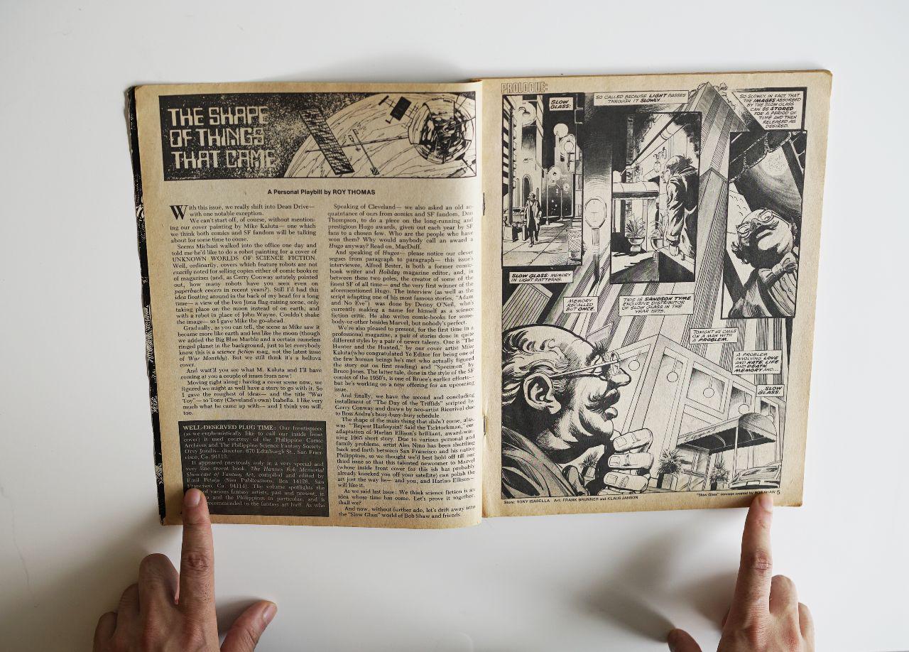
Anyway, Roy's peculiar editorial aside, the issue is actually pretty good! There's an awesome framing device they use which I just love; a prologue and an epilogue involving a substance called “Slow Glass”, which as the name suggests is a kind of glass that traps light for much longer than traditional glass, resulting in the capturing and preserving of events long after they've occurred. If a piece of Slow Glass was present where something major might've happened, and you were to get ahold of that Slow Glass, you could essentially “watch” the events unfold inside the glass. Pretty neat idea if you ask me, credited in the magazine to Bob Shaw.
In this issue's prologue the exclusive distributor of Slow Glass, a Mr. Sandson Tyme (cheesy, I know, but you gotta love it!) is making a house visit. Mr. Wilder lives on the 27th floor in a hideously lavish palace of an apartment, and for reasons not entirely clear yet he is very distressed and in severe need of a... “diversion”. A distraction from his thoughts, hence Sandson's Slow Glass.

Notice how that ingenious panel layout gives the impression of almost falling into the story captured within the Slow Glass (scripted by Tony Isabella with art by Frank Brunner and Klaus Janson).

The first story is WAR TOY written also by Tony Isabella with Art by George Perez and Rico Rival. I gotta say, not only is it refreshing to see George Perez art in black and white, but it's also great to see him knock out non-superhero stuff. The story by Isabella doesn't go deep into the philosophical questions about artificial consciousness that are kind of typical of robot stories (although it does slightly touch upon it, I guess), it's more of a morality tale. A story of “bad karma” once society screws the robot over essentially.
It is then followed by an interview with Alfred Bester conducted by Denny O'Neil! (who is very much associated with Marvel's competition, DC Comics, and is kind of odd to see him in what is primarily a Marvel vehicle). Bester of course is most famously known for science fiction novels such as THE DEMOLISHED MAN and THE STARS MY DESTINATION, which may give him more cache than Denny O'Neil, but y'know... even based solely on this interview, this is a situation where the interviewer strikes me as far more interesting than the interviewee.
The interview is cut short (continued at the very end of the magazine, not sure why olden publications did this), and followed by a one-page installment of GULLY FOYLE, an Australian adaptation by Stanley Pitt of Bester's THE STARS MY DESTINATION. Too faithful an adaptation if you ask me, resulting in panels that are obtrusively wordy. The artwork however? Quite phenomenal. Brilliant grasp of light and shadow, and some mark-making there that I've never quite seen anywhere else.
Denny O'Neil together with Frank Robbins and Jim Mooney deliver another Bester adaptation in this edition, titled ADAM... AND NO EVE, another kind of morality tale that's rather reminiscent of the EC stuff, both visually as well as conceptually.

Of course you might've noticed that Marvel branding is completely absent from the cover. The only clues to this being a Marvel vehicle lies in the indicia (“published by Management Magazine Co. Inc.” which owned Marvel at the time) and the ads, many of which are house ads. Why the the distributor's logo is on the cover, I'm not entirely sure. Makes me wonder if this was a “packaging job”; whereby Curtis hired Marvel (or Magazine Management Co.) to produce the magazine for them. 🤷

Generally speaking, Marvel's output has always been affected by the business model of its parent company. When owned by a “magazine management company” it leaned heavy on putting out magazines, including some containing material it did not own. When bought up by a toy company, it became more of an IP farm for characters that could potentially make great toys. As a subsidiary of Disney, it serves also as an IP farm, but with a bit more concern for the cheap development of all-ages blockbuster storylines that can be adapted to the screen, big and small.
Don Thompson writes an article in the magazine, about how the Hugo awards came to be, essentially a direct result of the growth of fandom.

There's a pretty interesting short written and drawn by Bruce Jones, with typeset letters.

Interestingly enough, none of the comix are lettered by anyone other than the artist. Not odd for comix in most places, but far from common in the American industry, especially anything that came out of Marvel.
Jones' 8-pager involves a guy with a captured specimen, who happens to be a woman, on a spaceship. She attempts to seduce him throughout the strip, much to his resistance, until he can't take it anymore and releases her from her cell. At which point, he drops his “thought screen” and his true nature is revealed...

Jones' SPECIMEN is then followed by THE DAY OF THE TRIFFIDS, a 20-page(!) installment continued from the previous issue, an adaptation by Gerry Conway and Rico Rival of a John Wyndham novel. I gotta say, Rico Rival (who assisted George Perez on WAR TOY) provides the most cinematic visuals in the entire magazine. Fantastic compositions and gorgeously fluid line-art. I'm really taken aback by my not having heard of him before. Will have to seek out what else he's done. The story is a little oldschool, but Conway and Rico do a commendable job at delivering it, before transitioning to the “Slow Glass” epilogue by Isabella, Brunner, and Janson that closes the issue.

Where it is revealed that the agitated Mr. Wilder killed his wife for fear of her cheating on him. But not before he captured her perfect likeness in a large pane of Slow Glass he had previously acquired from Sandson Tyme.
Over all, strong issue! My favorite is definitely the framing device, and the original comix more so than the adaptations. The particular interview and essay in this issue weren't particularly groundbreaking pieces of writing, but as a concept... to have a magazine that would include all that stuff is in itself refreshing. UNKNOWN WORLDS OF SCIENCE FICTION was short lived with only 6 issues ever published, but I think there's value in reexamining it, looking at what it did right and what it may have done wrong, rather than overlook the entire thing and toss the baby out with the baby water so to speak.
Reasons for its demise could be numerous: – Excessively faithful adaptations that leaned towards the very verbose. – The once every two months release schedule might've been too wide a gap. – Too many Marvel-centric ads and not enough science-fiction-related product placement? – The title? After all, UNKNOWN WORLDS OF SCIENCE FICTION comes off as a little too mid-century. This was 1975, at which point there already existed things like DANGEROUS VISIONS and METAL HURLANT (“Screaming Metal”). An edgier title could've done wonders! – Cover Art: The painted covers are beautiful! But (and this is a big but), they are awfully generic, aren't they? Definitely hearkening back to 1950's ideas of science fiction. But by 1975 people like Bob Pepper, Wojtek Siudmak, and Philippe Caza were already injecting science fiction paperbacks with cerebral visuals that were outright weird, surreal, and trippy!
Who knows? The reasons for cancellation may even have nothing at all to do with the content. But whatever the case, it's an interesting look at a bit of lost history, a look at what could've been.
And nothing ever goes to waste. It's entirely possible that somewhere in this carcass is a seed for better, more glorious things to come.