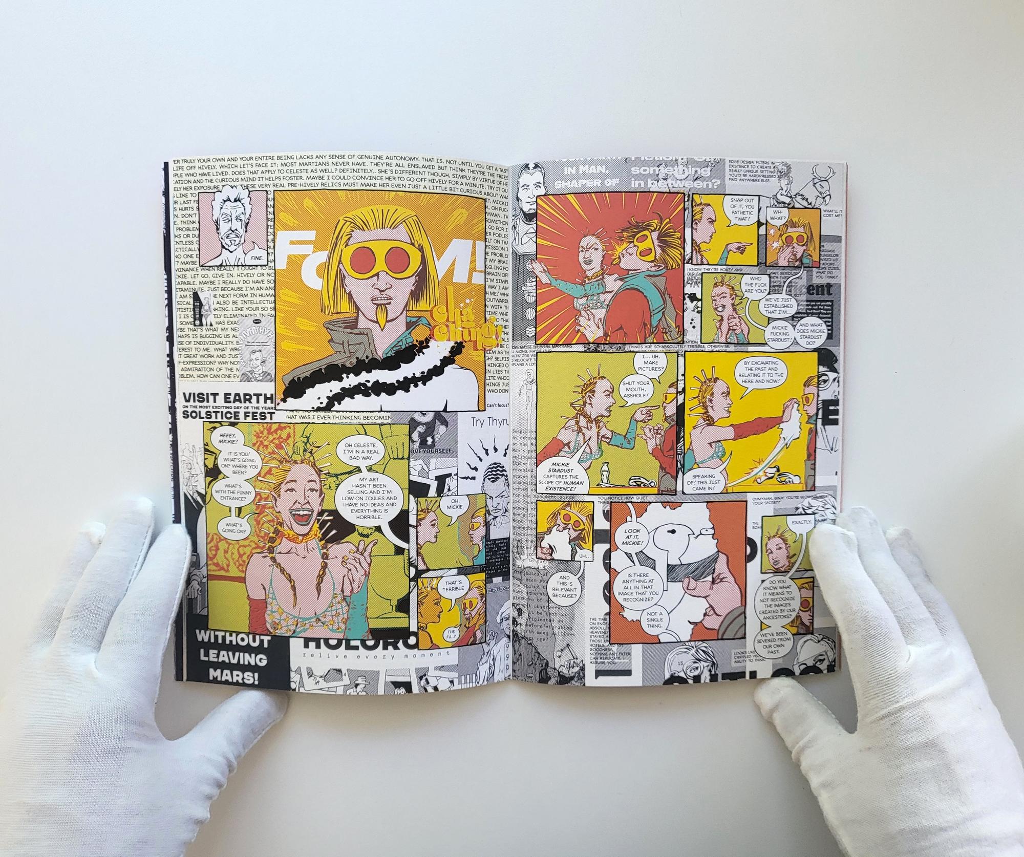
PROJECT OLDBOOK trudging along, around the midway point now. Really need to move faster though.
Very early on in the project, the idea of something AI-based was suggested. But no, I ended up going in the absolute polar opposite direction with the most tactile and labor intensive thing imaginable for some reason.
Masochistic tendencies probably.
#work
Steven Heller isn't wrong in calling me an “Artist Who Designs (and Vice Versa)” in this short interview over at his blog The Daily Heller (hosted by Print Mag).
Quite an honor to be featured on Steven's blog. I remember first encountering his book, Design Literacy, at the tender age of 19 some decades ago. Very formative reading for me and one that I still recommend to young designers just starting out.
#journal #coverage
Accounting today, which I am behind on and will certainly suck my soul dry by day's end.
Also on the docket:
– Fulfilling Mythomatic orders.
– Meal prep (because not enough time over the weekend).
– Excercise
And that's probably already one thing too many to fit into a single workday.
#journal
Love me a good drag show.

The thing about drag shows is that they could either be a sign of a closed society (where women performing in public is considered taboo) or an open one (where men needn't abide by heteronormative restrictions). I get the sense that in Houston, it's actually a little bit of both.
#journal
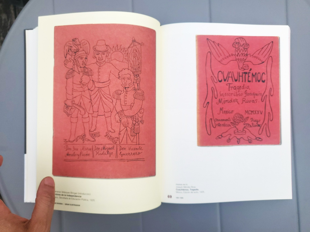
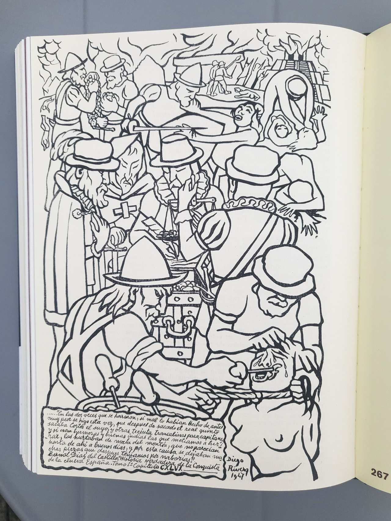
We all know about Diego Riviera the great muralist, but seldom do we hear about Diego Riviera the illustrator.

Picked this up in Mexico some time ago and I am positively obsessed. I'm not entirely sure why, but there's a quality to Riviera's lineart that I find wholly attractive.


#art #books

Sometimes you just gotta bust out that glue stick.
Nothing about how I approach comix is conventional, and it's going to get weirder and weirder.
Inboxes zero. Glorious day.
#work #comix #TSG
Apparently, there are websites you can't access from Texas anymore.
I remember how the use of VPNs became quite wise in Egypt towards the tail end of the half-revolution, certainly becoming a thing amongst more tech-saavy folk. Never would I have expected it to become a necessity after settling in America, but here we are.
The downfall of western civilization aside, work on TSG coming along today. Detailed fucker of a page though.
#journal #ResistDystopia
Awoke last night to the sound of thunder and discovered a mad storm brewing, lightning from every direction blasted bursts of light into the apartment. Most of the morning was gray, the city enveloped in thick clouds. Then suddenly by day's end, the blue behind the clouds revealed itself and the sun shone bright. It would've been sweltering hot had it not been for the windy tail end of the storm playfully lingering about.

Not much of an art-making day, but a good day nonetheless. Newsletter drafted and scheduled for late Friday night central time. Mythomatic orders dropped off at post office, and groceries picked up. Many emails responded to, but still going through the rest. 51 between inboxes, but many are notifications, and a few are bills.
Tomorrow should be a good TSG day, and Friday can be blocked off for Project Oldbook.
#journal
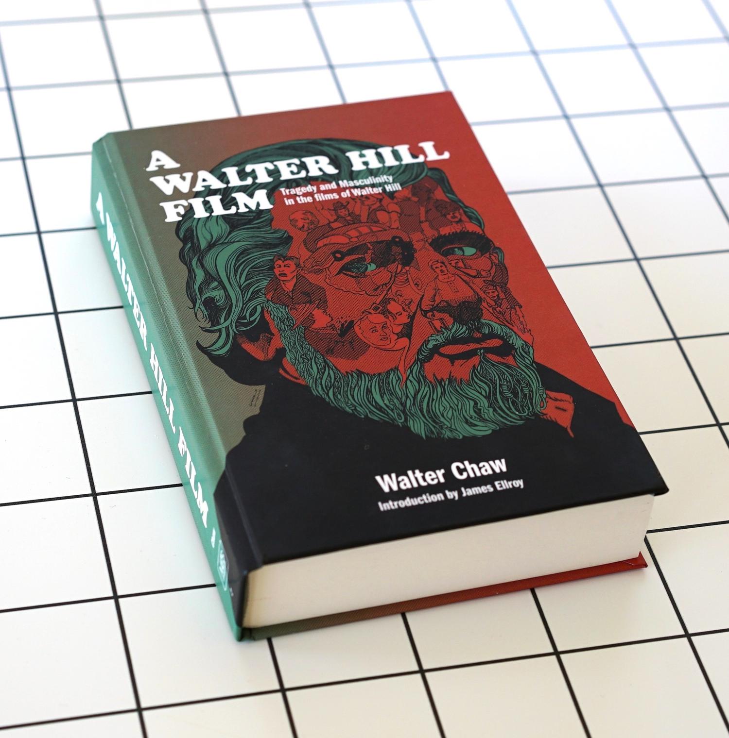
Drew and designed this cover back in 2019, but it wasn't published until late 2022, and I only got my comp copy this year because Walter (Chaw) was so adamant about getting it signed by Walter Hill for me. I'm glad he did, it's a delightful and humbling inscription which I'm keeping private. A fluke at the publishing house seems to have resulted in the absence of my credit though. Oh well. More pix of the book here.
Still recovering from toddler germs, may need another full day to recover. Can't write or draw for shit, so I figured working on [very belatedly] populating the website with projects from the past couple years is a mindless enough task for me to muster. Also getting the new newsletter platform in order. Getting all systems up to speed for optimum operation. There will be quite a bit of that over the next month or so after which I'm hoping for smooth, seamless sailing.
#work #journal

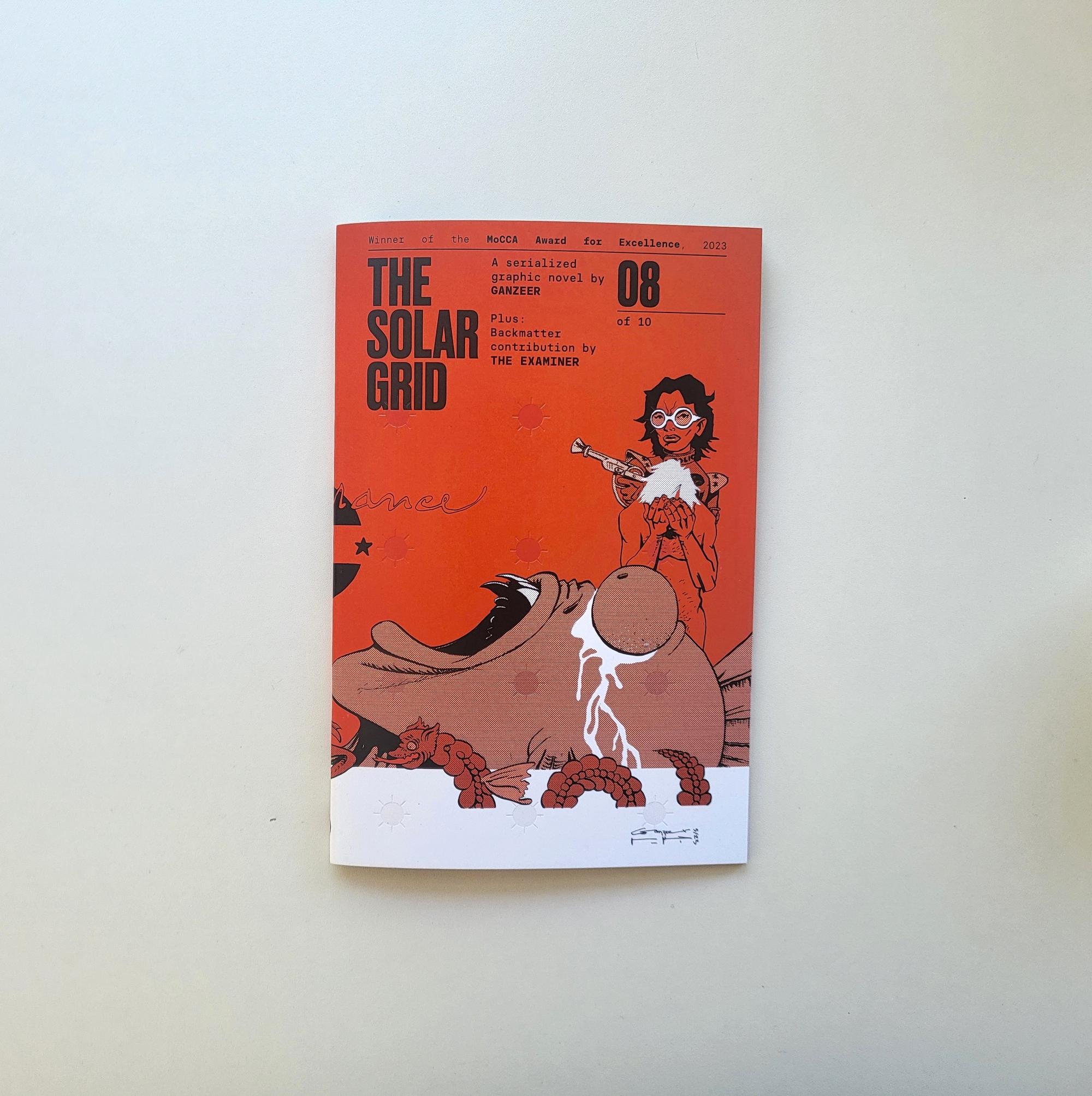
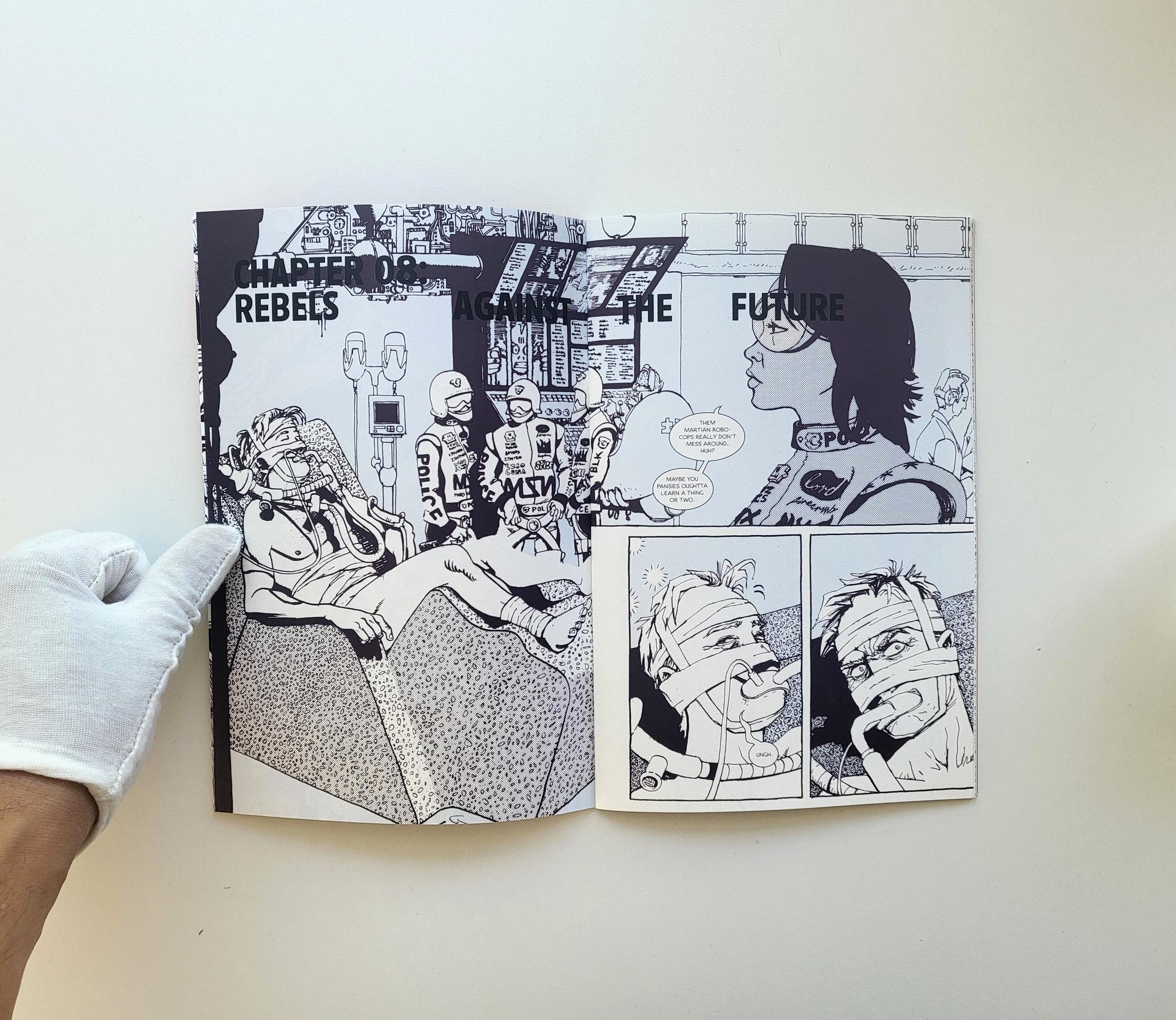
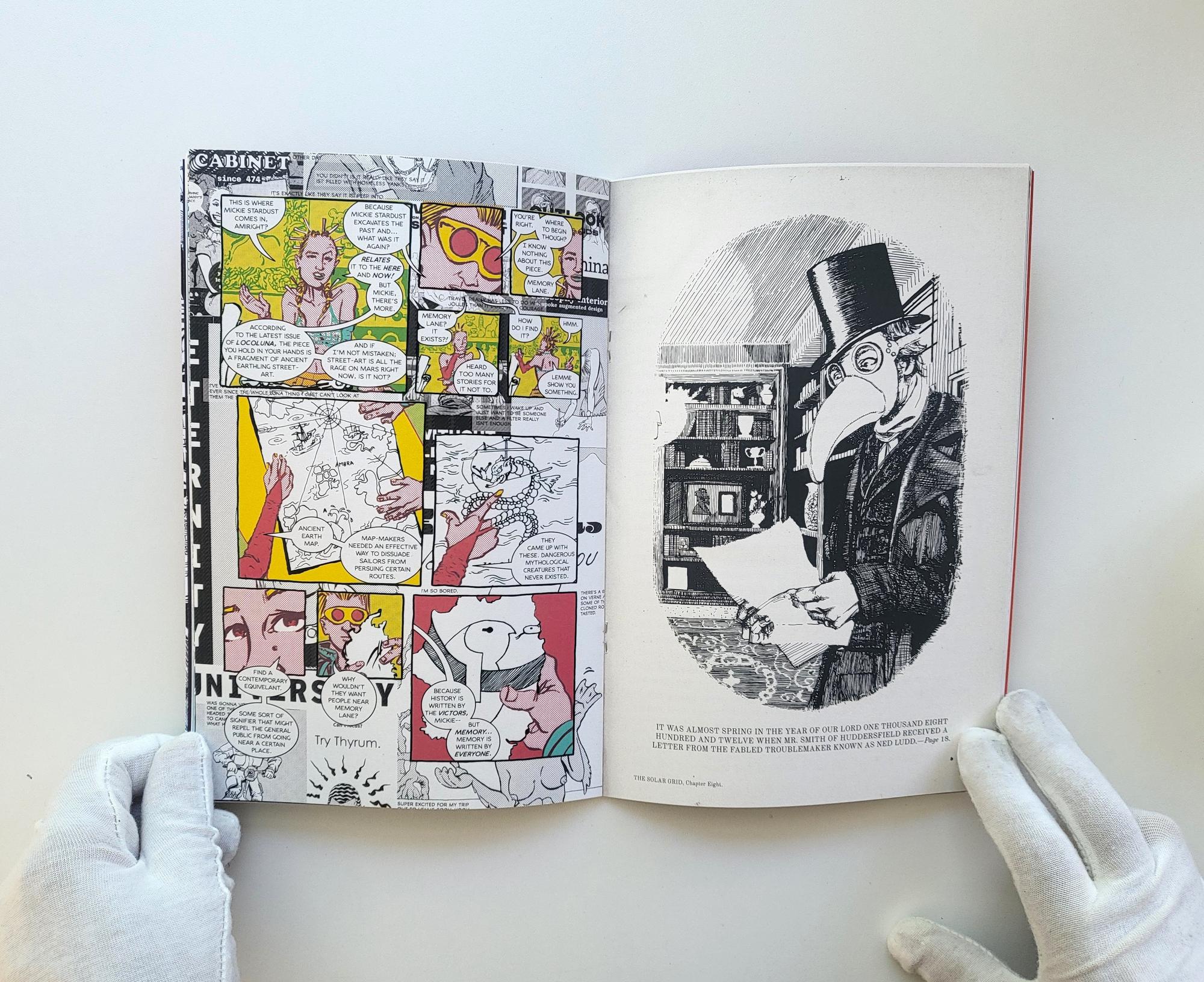
The latest THE SOLAR GRID installment is now available in print.


Only two more bad boys to go and I will be done forever.
#work #comix #tsg


