G A N Z E E R . T O D A Y

TheSolarGrid

The way I arrived at my post on “The Ultimate Art” (which as mentioned in the original post, is less a statement and more of an exploration), was quite odd and unexpected. It's all the fault, believe it or not, of my longtime work-in-progress graphic novel, THE SOLAR GRID

I knew from the get-go that I wanted to have a festival scene in this future post-eco-disaster version of Earth. It wasn't until I got to the chapter at hand, which is about 70% into the book that I knew it had to be a summer solstice festival (June 20 to be precise), because that would be the longest day of the year and thus, the day with the shortest Solar Grid hours (which is only activated come sundown). What with the Grid's blinding lights and harsh effects, it makes sense that the day you'd have to deal with it the least would be cause for celebration.

However, as is the case with cultures today, mythological fictions are created around most of our festivities (Think Christmas, Ramadan, or Holi), so I had to come up with a mythology around the cause of this summer solstice celebration that would make sense to the fictional characters who inhabit the world of THE SOLAR GRID. And that mythology had to be based on historical events that would have taken place in that world's history in addition to a kind of bastardization of the popular faiths and mythologies of old (because if you read about faith and mythology long enough you realize that's exactly how this sort of thing works).

I also know that it's important not to bang the reader over the head with this stuff, because none of it is really all that integral to story. It's sort of like... if you have a funeral scene in a [Western] movie or comicbook, you're gonna have the usual things: a tombstone with a cross on it, friends and family looking somber and dressed in black, a priest reading something from the Bible maybe or I dunno, just saying some wise shit (significantly different to what I witnessed of funerary rituals in, say, Vietnam for example). But basically, all of these rituals are part of a religious belief that has its own history and development. So, y'know, you wouldn't have a cross on a tombstone if Jesus was never crucified, nor would you have a priest reading the Bible without the Codex Vaticanus, or heck, Gutenberg much later.

Now of course as an author, you don't really need to go into that history when drafting your [Christian] funerary scene because everyone already knows the rituals and what they relate to. If, on the other hand, you're creating a story that takes place in the far off future after everything we know has been destroyed and the dating system itself restarted, then it makes sense that the people of that world would have a different religion(s) to go with their very different reality. And in constructing what their summer solstice celebration might look like, it occurred to me that everything involved in it (costumes, songs, dance moves, decoration, etc.) couldn't just be arbitrary, but would have to relate entirely to their “religion”, which meeeeant... I had to actually construct the entire religion and its historical development.

Even if I'm in actuality only showing a tiny glimpse of that religion in the graphic novel (think your typical Christian funeral scene in relation to the entire history of Christianity), I knew every little thing in that tiny glimpse had to be based on some kind of history for it to ring true, even if I never reveal said history in the book.

So basically, I had to create a fictional religion and I had to do it as earnestly as possible. Which sent me down a rabbit hole that somehow lead to the “Ultimate Art” post, which doesn't even cover half of what's going on in my head right now.

Yes, I think this cursed graphic novel will drive me mad too.

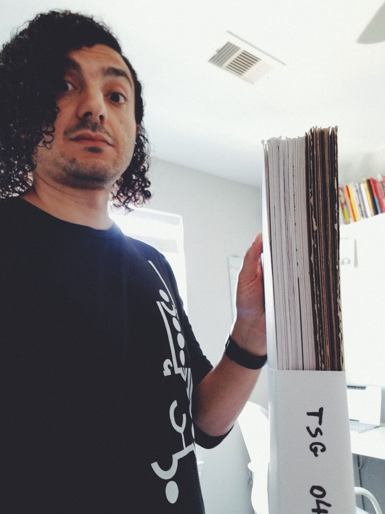
Pictured above is the print edition of THE SOLAR GRID #1, essentially the first chapter, forthcoming from Radix Media and Mythomatic on April 21st (coincidentally: Astronomy Day! And one day shy of Lyrids Meteor Shower).

#Journal #TheSolarGrid #comix

Finally made it to a spread I've had in mind since I first conceived of THE SOLAR GRID some 5 years ago. Feels great to finally relieve my mind of retaining it.

Still, a lot more stuff trapped in there looking for a release.

#Journal #Work #TheSolarGrid #Comix

Having added this “murder wall” on a whim inside the lunar police captain's office (THE SOLAR GRID, Ch. 6), some function in the back of my head is now tinkering with the thought of a serial killer on the moon. This has no place in THE SOLAR GRID proper and there will be no mention of it, but if in the future I ever want to mess around with a detective procedural type thing, I may be enticed to set it on the moon in the world of THE SOLAR GRID. I wouldn't want the setting to be pointless dressing of a run-of-the-mill detective story though; it would have to be an integral part of the concept and tie in closely to notions of trade, migration, and imperialism (what with the Moon acting as a kind of port city in space within this particular world). One thing I hate about most detective stories is that they (knowingly or not) act vehicles of police propaganda, so I imagine I'd want to turn my story around and make it an indictment of policing instead.

Simple though, and not overly elaborate; a tight slim graphic novella. Then again, I've littered THE SOLAR GRID with so many little easter eggs that could all very easily warrant their own little graphic novella spanwlings.

This is perhaps where a regular magazine might come in.

There's a bit in the introduction to KALILA & DIMNA that does not mince words as to the work's approach, an approach that very much speaks to my own philosophy of Concept Pop: Wisdom enveloped within entertainment. The wise come unto it for the wisdom, and idiots come unto it for the fun.

And there's a bit in Thomas Mann's DEATH IN VENICE speaking to me in equal measure. The bit that describes Gustave Aschenbach's epic on the life of Frederick the Great (wherein both Gustave and his work are of course fictitious): “Outsiders might be pardoned for believing that his Maia world and the epic amplitude revealed by the life of Frederick were a manifestation of great power working under high pressure, that they came forth, as it were, all in one breath. It was more the triumph for his morale; for the truth was that they were heaped up to greatness in layer after layer, in long days of work, out of hundreds and hundreds of single inspirations; they owed their excellence, both of mass and detail, to one thing and one alone; that their creator could hold out for years under the strain of the same piece of work.”

It's been 5 years of THE SOLAR GRID to date. Hopefully not more than 1 more year to go. After which, I may need to indulge in a perverted masquerade or two.

Not in Venice necessarily.

#Journal #Work #Comix #TheSolarGrid

For the past couple of weeks now, I end my days without completely ticking off everything on my deck because my assessment of what I can handle has been a bit off. Today however is the first day in a while where I got all the things done and even added a couple more since I had the time. Squeezed in a short workout too, and whipped up a mean chicken fajita bowl for dinner. Life is good.

Pencils for THE SOLAR GRID Ch.6 are getting looser by the day (see above) as a result of having taken on multiple work-for-hire stuff this month. Which may not be a bad thing. It just leaves more room to actually draw stuff in the inking stage. Something I'm gonna need to account for when allotting time for it. Keeping inks till after I'm done with these other projects.

#Journal #Work #Comix #TheSolarGrid

Finally done thumbnailing Chapter 6, clocking in at 34 pages (not including backmatter to be provided by Elliott Colla) despite my initial estimate of it coming in at 18!

That's okay though; you discover things in the thumbnail process that aren't absolutely evident when you're just writing/plotting the thing. Sequences that you feel ought to be handled as such:

That's from Koike and Kojima's LONE WOLF AND CUB.

You can certainly show someone leaving a scene in one single panel, but that difference in pacing results in a different emotional impact. And you need to oscillate between various approaches to pacing as per the needs of each scene. I've certainly applied the fast-cut-exit approach a couple times already.

To the left is a flashback sequence from Chapter 4, and to the right is a scene from Chapter 5 set in Japan (hence, that sort-of manga vibe).

Earlier in Chapter 3, I had a scene that required a much slower exit, just to give a sense of the scope of the place being exited from.

As it turns out, Chapter 6 needed a few slow moments. But then again, I'm not awfully religious about sticking to my thumbs, and will often change things up when I work on the actual pages (as is evident when comparing thumbs for Chapter 4 with what actually became of the chapter).

Radix Media's kickstarter (which includes a serialized edition of THE SOLAR GRID) is now 90% funded. A couple thousand (and a few hours) to go and their entire Graphic Narrative series will be greenlit!

#Journal #Work #Comix #TheSolarGrid

One of my favorite stages in creating comix is the thumbnail stage, where you plan out your pages in miniature form. This is where the bulk of creative choices in regards to storytelling, transitions, reveals are made. First 3 chapters I used regular letter-sized printer paper, folded in half, but the pages were loose and I misplaced them often, so for Chapters 4-onward, I adopted an A6-sized blank Leuchtturm 1917 notebook, which I like very much. I imagine it'll serve as my vessel for all manner of comix-thumbnailing for the foreseeable future (which will hopefully result in the accumulation of a whoooole stack of them 🤞).

My thumbs aren't pretty—nowhere near the tightness of say... a Dave Gibbons—but for those who are into this sort of thing, I've made available the entire thumbs for Chapter 4 of THE SOLAR GRID, my longest chapter to date.

#journal #work #comix #TheSolarGrid

The 3rd track in the sonic companion to THE SOLAR GRID graphic novel has dropped! THE SOLAR GRID SOUNDSCAPE by N Slash A is absolutely wild. I cannot stop listening to all three tracks back to back.

#Journal #Work #TheSolarGrid

Realizing that “THE SOLAR GRID” doesn't quite have anywhere near the same commercial cache as, say, a SPIDER-MAN or STAR WARS, I thought maybe I don't need to have the title run so large across the top bit of the cover and perhaps a more unusual layout for the cover-dress might serve as a better visual attractor.

Still best to abide by the top third rule though, so maybe something more like this:

Still have room to let the artwork creep into that section, but visually it should stand out a bit more than the typical comicbook cover.

Notice no publisher logos, will probably move them to the back alongside the barcode. I dunno, it's more tasteful that way?

EDIT: On second thought, maybe bigger issue number...

#work #design #comix #thesolargrid

Cover Design isn't solely an aesthetic endeavor but involves a great many practical considerations as well, which differ as per what the cover design is for. Not solely because of the content it is meant to reflect/package, but more importantly how it is retailed and displayed. Ultimately, a cover design's most important function is to sell the product, so how the product is sold must inform how the product is designed.

When it comes to comicbook covers, I used to think that the approach to design that has dominated the industry for decades was largely due to a failure of the imagination: cornerbox featuring company logo, issue number, date, price, next title.

Notice, I'm focusing here on what is often referred to in the industry as “cover dress”, not the illustration that goes on the cover (which also has its share of redundancies across the comicbook industry).

However, it should be noted that the first time I ever set foot in an American comicbook shop wasn't until my early 30s, and thus had very little idea of how comicbooks were sold in America. Up until that point, I'd gotten my comix off sidewalks in Cairo or the occasional store in Europe if I was ever passing through, where the approach to retail completely differs to that in America. Once I stepped into my first American comicbook shop though, I immediately got it.

photo by Neil Strebig for Pittsburgh Magazine (photo by Neil Strebig for Pittsburgh Magazine)

Most comicbooks are displayed in a way where only the upper 1/3 of the cover can be seen, so it is in that space that the most important aspects of the design need to be seen.

With that in mind, the idea to include a small illustration of the title's protagonist in the corner-box is one of the most ingenious design solutions comix have ever come up with.

Curiously though, without any notion of how comicbooks are typically displayed in America, it's one of those things that make absolutely no sense whatsoever. For many many years I couldn't help but wonder why on Earth I'm seeing more than one illustration of the protagonist on the cover! One very small in the corner and the other really big, likely slugging it out with bad-guy-of-the-month! And it's a design choice that's so particular to comicbooks. You don't see it on novels, VHS tapes, videogames, just comix. So without knowledge of how comicbooks are displayed in North America, it really does stand out as a peculiar thing. But comicbooks aren't sold exclusively in America, are they?

It is perhaps for that reason that we've seen instances of cornerbox art completely eliminated, while retaining all the other stuff. And there are of course examples that don't involve a cornerbox at all, but are still concerned with having all the vital elements occupying that top third portion of the cover.

Recently, DC Comics has come up with a pretty clever approach to the cornerbox by incorporating character logos as an identifier instead of the redundancy of character illustrations (not so sure about the rest of their cover dress though, which could use a sly hand of minimalism if you ask me).

I've been noticing though that in the past 6 years or so, many a comicbook cover have abandoned all criteria of previous decades, becoming far more inventive (and designy) in regards to both illustration and cover dress. Really exciting and admirable stuff, but with complete disregard for how comics are typically displayed which I'm not so sure is beneficial to their saleability.

Ultimately, the sweet spot is in coming up with creative design solutions while still keeping in mind the particular importance played by the top third portion of the cover.

None of this however is of any importance when your comic is intended for digital distribution. In fact, what applies to a comicbook cover intended for print may in fact be detrimental to the visibility of your comic on the web (or a comix-reading app). And it is that concern that drove my design approach for the cover designs of THE SOLAR GRID.

Given that the covers would initially be seen as thumbnails, the text had to be large and easily legible at such a small size (I should also acknowledge input from my friend Sherif Samy who urged me to come up with a design that was contemporary and forward-facing, with prominent typography). And with the text eating up the majority of the cover the illustrative component had to be kept at a minimum: one single object per cover. My choice to use objects as opposed to characters was, to be completely honest, somewhat accidental. I had a “concept drawing” for this makeshift shuttle that appears very briefly in Chapter 1, and well, it was a pretty detailed drawing! Figured it might look good on the cover. Later, after the fact, I noticed how that moment in Chapter 1 where the shuttle appears, although not the biggest most important moment in the chapter, it is quite... integral. And then came the idea of using objects on all the covers, objects that seem inconsequential at first but maybe actually aren't when you stop to think about it.

That was one aspect of my thinking. The other was my desire to differentiate THE SOLAR GRID's look from the typical comicbook as much as possible, because well... it is so different! And since most comicbook covers tend to feature characters, I was going to NOT FEATURE CHARACTERS AT ALL!! HAHA!

In hindsight (some 4 years later), I'm not entirely sure that was a good idea. Mainly because too much of THE SOLAR GRID has been different!

I mean:

  • Digital only
  • Self-published
  • Largely unknown creator
  • Writer, illustrator, letterer, editor all one and the same!
  • Irregular release schedule
  • Irregular page count (sometimes 40 or 34 or 86, etc.)
  • Black and White (for the most part)
  • Minimal cover design
  • Don't get me started on the actual story.

It's just so different! Not on one or two levels, but multiple ones. And now I think it's wise for there to be at least some degree of familiarity for the average comicbook reader, at least 3 out of 9 of the above things can be a bit more akin to what the average reader might be used to.

But, the OCD designer in me deems it necessary to stick with the object-focused cover illustrations for the remainder of the “run” (none of which will appear in the eventual book collecting the material, because these covers were never intended for print, they're for online).

Although, I gotta say... they still look pretty dope in print:

Now, however, with THE SOLAR GRID due for publication as a series of chapbooks/floppies (shuush, I'm not sure I'm supposed to mention it yet 🤫), I've been thinking about how to go about designing covers for those with physical retail in mind. Granted, these editions will be put out by a small press in very limited quantities, and as such wouldn't be of great interest to the vast majority of traditional comicbook shops, but still; In the event that a shop does indeed decide to carry it, it'd be nice if the design took that into consideration.

So here's what I've been thinking:

I've designated the uppermost top bit to feature a blurb, fully realizing that as someone largely unknown in the comicbook landscape, a prominently featured nod from someone better recognized than myself might encourage the casual reader to check it out. The remainder of the top third portion features the title, author credit, and issue number. The “serialized graphic novel by” part may seem a bit unusual as far as comix go, but I think it's important to denote that what they're about to read really has been conceived as a graphic novel and not as a series, the latter being the default in the comicbook industry (even mini-series or maxi-series aren't quite the same as graphic novels as far as I'm concerned—in the same vein that a limited television series isn't quite a film).

Publisher logos aren't in the top third and instead are moved to the bottom right corner, because well, I don't think they hold any cache within the comicbook landscape, and also to avoid that look that's been so associated with corporate publishers, where the corporate brand tends to dominate.

On the topic of publisher logos, you'll notice placeholders for two: Mythomatic and “PP”. The latter stands for “Publishing Partner” which I won't be announcing just yet, and Mythomatic will be my own boutique publishing imprint which will focus on beautifully produced publication. Not just for comix, mind you, but still preoccupied with printed matter that is largely visual in nature. Starting really small and expanding one careful half-step at a time.

Unlike the digital covers, this leaves a pretty large canvas for illustration placement. Some of which may even peep into that upper third portion. I'd like to be really strategic about kind of visuals make it into that bit, and not let it occur just randomly. Rather than a straight representation of a scene, as is common with most comicbook covers, I'd like to tap into the weird/surreal vibes associated with cerebral cover art of 70's science fiction paperbacks. I'm thinking of that Bob Pepper energy, and Wojtek Siudmak, and Caza (none of that space opera stuff ubiquitized by STAR WARS).

Color scheme will remain the same as that used for digital installments, including of course the dot-grid. I like that graphically, even without an illustration at all, you have something that reflects the central high concept of the book.

I'm also thinking wrap around cover-art might be in order, given that unlike corporate monthly comics, these would have no advertisements on the back. And also unlike the digital editions they won't be featuring quotes.

I'd devised this thing (stolen from WATCHMEN, I reckon?) where chapter titles are extracted from popular quotes. One of my chapters however, at 86 pages would be a little too thick for saddle-stitched binding (staples), so that one at least will have to be divided up, which means my original chapter breakdowns will not apply to these editions. So out go the quotes associated with each chapter.

The eventual hardback edition collecting all the material however will abide by the original chapter breakdown, but it will be a smaller trim-size than the traditional comicbook. 6” x 9”, a size commonly used for novels, fits nicely in a pair of hands, and great for taking with you to the coffeeshop or curling up on the sofa with (the 6.625 x 10.187” of the standard U.S. comicbook works well for monthly floppies, but not so much for collected editions if you ask me). And of course, the cover design for the hardback doesn't need to abide by the same design criteria needed for the comix installments since retail considerations are completely different (special care ought to be given to the spine actually).

So really, rather than a one-design-fits-all approach, we're looking at 3 different approaches to cover design per format: digital, hardcopy installments, and hardcopy collection.

#work #comix #design #thesolargrid

I woke up at around 2:30AM last night (this morning?) and devoured an entire brownie. Just shoved the thing in my mouth and gobbled it down. It was time to feed child who awoke agitated, and I found myself dozing off as I stumbled to warm up his bottle.

No time to fix myself coffee or tea, but I needed a hit of something to keep my eyes open, and that something ended up being the brownie.

It did the trick, and the crash that followed was most pleasant. I slept very well.

Sleep is something I'm looking forward to doing bit more of this week, now that the 5th chapter of THE SOLAR GRID has finally gone live!

What a journey making this one has been! Started it in Denver over a year and a half ago (!!!), interrupted by relocating to Houston, first to temporary lodgings before finding the place we're currently in, followed by pandemic and lock-down and finally birth of child! 🤯

Also, it's the first chapter that features color (which I also did myself), not for the sake of just wanting to do comix in color, but as an integral component of the storytelling. I also feel like the storytelling breakthroughs in this one are numerous and I'm really proud of how it all turned out. Also, Josh MacPhee's written supplement? A freakin' treasure!

All in all, a landmark installment that has me more excited than ever to dive right into Chapter 6!

Okay, well maybe not riiiiight into Chapter 6. I'd like to take a day or two to organize around the studio. The aftermath of each of these always involves a fair amount of debris. Also need to respond to a handful of emails I've neglected, and ship out a few ganzeer.garage orders.

#journal #work #comix #TheSolarGrid