Cover Design isn't solely an aesthetic endeavor but involves a great many practical considerations as well, which differ as per what the cover design is for. Not solely because of the content it is meant to reflect/package, but more importantly how it is retailed and displayed. Ultimately, a cover design's most important function is to sell the product, so how the product is sold must inform how the product is designed.
When it comes to comicbook covers, I used to think that the approach to design that has dominated the industry for decades was largely due to a failure of the imagination: cornerbox featuring company logo, issue number, date, price, next title.

Notice, I'm focusing here on what is often referred to in the industry as “cover dress”, not the illustration that goes on the cover (which also has its share of redundancies across the comicbook industry).
However, it should be noted that the first time I ever set foot in an American comicbook shop wasn't until my early 30s, and thus had very little idea of how comicbooks were sold in America. Up until that point, I'd gotten my comix off sidewalks in Cairo or the occasional store in Europe if I was ever passing through, where the approach to retail completely differs to that in America. Once I stepped into my first American comicbook shop though, I immediately got it.
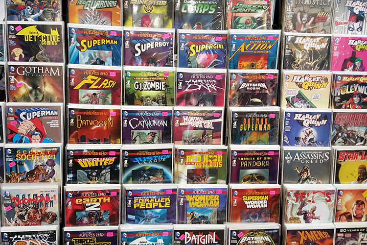 (photo by Neil Strebig for Pittsburgh Magazine)
Most comicbooks are displayed in a way where only the upper 1/3 of the cover can be seen, so it is in that space that the most important aspects of the design need to be seen.
With that in mind, the idea to include a small illustration of the title's protagonist in the corner-box is one of the most ingenious design solutions comix have ever come up with.

Curiously though, without any notion of how comicbooks are typically displayed in America, it's one of those things that make absolutely no sense whatsoever. For many many years I couldn't help but wonder why on Earth I'm seeing more than one illustration of the protagonist on the cover! One very small in the corner and the other really big, likely slugging it out with bad-guy-of-the-month! And it's a design choice that's so particular to comicbooks. You don't see it on novels, VHS tapes, videogames, just comix. So without knowledge of how comicbooks are displayed in North America, it really does stand out as a peculiar thing. But comicbooks aren't sold exclusively in America, are they?
It is perhaps for that reason that we've seen instances of cornerbox art completely eliminated, while retaining all the other stuff. And there are of course examples that don't involve a cornerbox at all, but are still concerned with having all the vital elements occupying that top third portion of the cover.

Recently, DC Comics has come up with a pretty clever approach to the cornerbox by incorporating character logos as an identifier instead of the redundancy of character illustrations (not so sure about the rest of their cover dress though, which could use a sly hand of minimalism if you ask me).

I've been noticing though that in the past 6 years or so, many a comicbook cover have abandoned all criteria of previous decades, becoming far more inventive (and designy) in regards to both illustration and cover dress. Really exciting and admirable stuff, but with complete disregard for how comics are typically displayed which I'm not so sure is beneficial to their saleability.
Ultimately, the sweet spot is in coming up with creative design solutions while still keeping in mind the particular importance played by the top third portion of the cover.
None of this however is of any importance when your comic is intended for digital distribution. In fact, what applies to a comicbook cover intended for print may in fact be detrimental to the visibility of your comic on the web (or a comix-reading app). And it is that concern that drove my design approach for the cover designs of THE SOLAR GRID.

Given that the covers would initially be seen as thumbnails, the text had to be large and easily legible at such a small size (I should also acknowledge input from my friend Sherif Samy who urged me to come up with a design that was contemporary and forward-facing, with prominent typography). And with the text eating up the majority of the cover the illustrative component had to be kept at a minimum: one single object per cover. My choice to use objects as opposed to characters was, to be completely honest, somewhat accidental. I had a “concept drawing” for this makeshift shuttle that appears very briefly in Chapter 1, and well, it was a pretty detailed drawing! Figured it might look good on the cover. Later, after the fact, I noticed how that moment in Chapter 1 where the shuttle appears, although not the biggest most important moment in the chapter, it is quite... integral. And then came the idea of using objects on all the covers, objects that seem inconsequential at first but maybe actually aren't when you stop to think about it.
That was one aspect of my thinking. The other was my desire to differentiate THE SOLAR GRID's look from the typical comicbook as much as possible, because well... it is so different! And since most comicbook covers tend to feature characters, I was going to NOT FEATURE CHARACTERS AT ALL!! HAHA!
In hindsight (some 4 years later), I'm not entirely sure that was a good idea. Mainly because too much of THE SOLAR GRID has been different!
I mean:
- Digital only
- Self-published
- Largely unknown creator
- Writer, illustrator, letterer, editor all one and the same!
- Irregular release schedule
- Irregular page count (sometimes 40 or 34 or 86, etc.)
- Black and White (for the most part)
- Minimal cover design
- Don't get me started on the actual story.
It's just so different! Not on one or two levels, but multiple ones. And now I think it's wise for there to be at least some degree of familiarity for the average comicbook reader, at least 3 out of 9 of the above things can be a bit more akin to what the average reader might be used to.
But, the OCD designer in me deems it necessary to stick with the object-focused cover illustrations for the remainder of the “run” (none of which will appear in the eventual book collecting the material, because these covers were never intended for print, they're for online).
Although, I gotta say... they still look pretty dope in print:

Now, however, with THE SOLAR GRID due for publication as a series of chapbooks/floppies (shuush, I'm not sure I'm supposed to mention it yet 🤫), I've been thinking about how to go about designing covers for those with physical retail in mind. Granted, these editions will be put out by a small press in very limited quantities, and as such wouldn't be of great interest to the vast majority of traditional comicbook shops, but still; In the event that a shop does indeed decide to carry it, it'd be nice if the design took that into consideration.
So here's what I've been thinking:
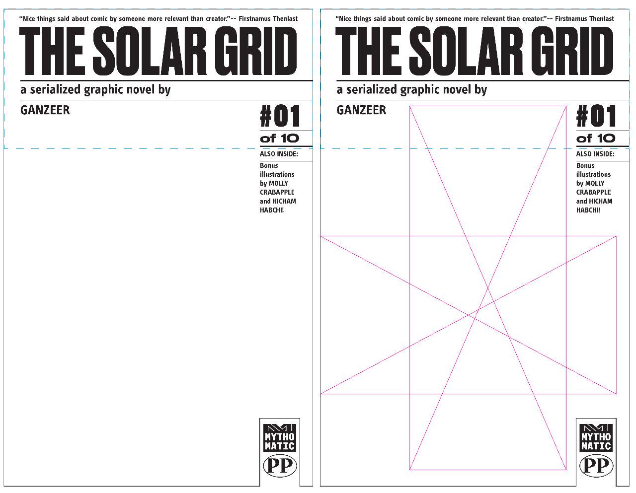
I've designated the uppermost top bit to feature a blurb, fully realizing that as someone largely unknown in the comicbook landscape, a prominently featured nod from someone better recognized than myself might encourage the casual reader to check it out. The remainder of the top third portion features the title, author credit, and issue number. The “serialized graphic novel by” part may seem a bit unusual as far as comix go, but I think it's important to denote that what they're about to read really has been conceived as a graphic novel and not as a series, the latter being the default in the comicbook industry (even mini-series or maxi-series aren't quite the same as graphic novels as far as I'm concerned—in the same vein that a limited television series isn't quite a film).
Publisher logos aren't in the top third and instead are moved to the bottom right corner, because well, I don't think they hold any cache within the comicbook landscape, and also to avoid that look that's been so associated with corporate publishers, where the corporate brand tends to dominate.
On the topic of publisher logos, you'll notice placeholders for two: Mythomatic and “PP”. The latter stands for “Publishing Partner” which I won't be announcing just yet, and Mythomatic will be my own boutique publishing imprint which will focus on beautifully produced publication. Not just for comix, mind you, but still preoccupied with printed matter that is largely visual in nature. Starting really small and expanding one careful half-step at a time.
Unlike the digital covers, this leaves a pretty large canvas for illustration placement. Some of which may even peep into that upper third portion. I'd like to be really strategic about kind of visuals make it into that bit, and not let it occur just randomly. Rather than a straight representation of a scene, as is common with most comicbook covers, I'd like to tap into the weird/surreal vibes associated with cerebral cover art of 70's science fiction paperbacks. I'm thinking of that Bob Pepper energy, and Wojtek Siudmak, and Caza (none of that space opera stuff ubiquitized by STAR WARS).
Color scheme will remain the same as that used for digital installments, including of course the dot-grid. I like that graphically, even without an illustration at all, you have something that reflects the central high concept of the book.
I'm also thinking wrap around cover-art might be in order, given that unlike corporate monthly comics, these would have no advertisements on the back. And also unlike the digital editions they won't be featuring quotes.
I'd devised this thing (stolen from WATCHMEN, I reckon?) where chapter titles are extracted from popular quotes. One of my chapters however, at 86 pages would be a little too thick for saddle-stitched binding (staples), so that one at least will have to be divided up, which means my original chapter breakdowns will not apply to these editions. So out go the quotes associated with each chapter.

The eventual hardback edition collecting all the material however will abide by the original chapter breakdown, but it will be a smaller trim-size than the traditional comicbook. 6” x 9”, a size commonly used for novels, fits nicely in a pair of hands, and great for taking with you to the coffeeshop or curling up on the sofa with (the 6.625 x 10.187” of the standard U.S. comicbook works well for monthly floppies, but not so much for collected editions if you ask me). And of course, the cover design for the hardback doesn't need to abide by the same design criteria needed for the comix installments since retail considerations are completely different (special care ought to be given to the spine actually).
So really, rather than a one-design-fits-all approach, we're looking at 3 different approaches to cover design per format: digital, hardcopy installments, and hardcopy collection.
#work #comix #design #thesolargrid


