It may not look like it yet, but the illustration I'm working on is for an essay that feels very timely with everything going on right now, penned by none other than Ahmed Naji.
Background listening is The Ottoman History Podcast, in particular a surprisingly rich episode on Mamluk Cairo. Surprising because it gets into some delicious details I knew little to nothing about; like the wandering carnivalesque peoples known as Al Ghurabaa` (“The Strangers”) and the odd jobs they performed, the fluid mix of tongues they spoke, and perhaps most interestingly of all... their printing.
“The Strangers” were the first to introduce printing to Egypt apparently, likely some form of woodblock printing (tin matrices were also employed), in languages ranging from Arabic to Coptic and Hebrew (and quite possibly more). Excited to learn more on the subject matter from Kristina Richardson's upcoming book; GYPSIES IN THE MEDIEVAL ISLAMIC WORLD: A HISTORY OF THE GHURABA, forthcoming with Bloomsbury Publishers.
It was in March last year when the Getty Museum in Los Angeles got in touch to record an interview on mythology, propaganda, and culture. This in conjunction with an exhibition they'd been planning on Assyrian art.
Armed with that recording and a few images of my work, Logan then went off and put together this short but striking video:
A couple of pieces of mine are featured in Human Rights Foundation's ART IN PROTEST online exhibition, namely:
While I appreciate the foundation's efforts to highlight the work of artists attempting to speak truth to power, I must say I am rather astonished that in their survey of “A Year In Global Protest Art” as indicated on their website, their list of 15 countries represents every continent on Earth except three: Europe, North America, and Australia—which I find wholly appalling.
This is, after all, 2020; the year in which the Black Lives Matter movement was revived with vigor in the wake of George Floyd's murder by police and sparked protests of unprecedented mass in almost every metropolitan city across the United States, inspiring similar solidarity protests across the entire planet! Neglecting Europe discounts the plight of Polish women fighting for abortion rights and the over 100 protests in France critical of the country's new security bill. And what of the protests staged by Aboriginal Australians? Who only demand the end of their murder at the hands of Europe's colonial descendants.
This very obviously non-accidental oversight shows how the “Human Rights Foundation” view on human rights is a completely politicized and racialized one wherein violators of human rights can only ever be governments helmed by “brown, black, and yellow people” but never ever the righteous oh so civilized “whites”.
Finally made it to a spread I've had in mind since I first conceived of THE SOLAR GRID some 5 years ago. Feels great to finally relieve my mind of retaining it.
Still, a lot more stuff trapped in there looking for a release.
The above piece featuring my friend Mona Eltahawy went out to the Letterform Archive in San Francisco, which acquired it for its permanent collection along with a couple of process pieces, namely:
Didn't even know such a typography-focused artspace existed prior to this. Looking forward to paying them a visit once this pandemic is no more and it's cool to board planes again, which from the looks of things shouldn't be too far off. 🤞
2020 is coming to a close, and looking at the work that was done this year... y'know, not entirely a bad year! There are even a couple things not yet listed on the site that got done, but won't be announced till January. Would've liked to get more THE SOLAR GRID out the door, but hey, there's always next year (and hopefully ONLY next year!!!).
My resolution will likely involve getting distracted by less things and finally bringing THE SOLAR GRID to a close (though I must admit I'm feeling the nastiest urge to create more erotica, but it's totally possible that it's just the pandemic getting to me).
It's becoming clear to me that I am almost always attracted to things that involve a combination of art, rebellion, and sex. So it makes sense that that's exactly the type of art project I oughtta set out to do.
Temperature is down to 8 degrees Celsius (46 Fahrenheit), which may not be as cold as some other places, but it's cold enough for me. Cold enough to rock my snuggies outside with zero fucks given (yes, that's what the pants pictured above are called, yes).
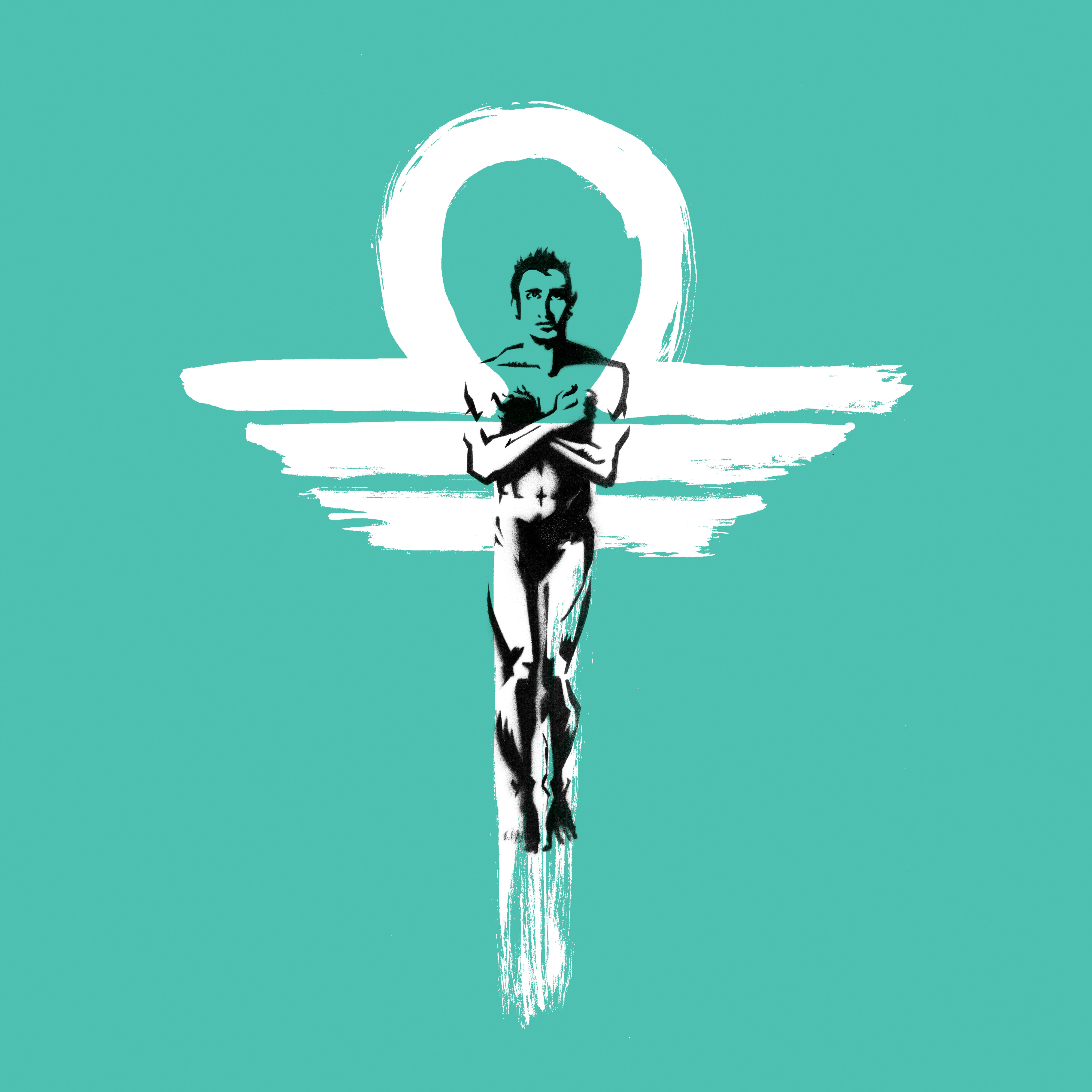
My virtual talk with Kickstarter's Oriana Leckert for Society of Illustrators went online, and today I'm back to work on TSG06! A scene that takes place on Enceladus to be precise.
The other thing in the above sneak, the brush-strokey ornamental wing, that's part of another thing I should be able to share by next month I think.
Okay, more coffee, more drawing, all in my snuggies.
Yesterday was the first day for me to catch a breather in two very intense sleepless weeks. Spent it tending to all the things I'd had to neglect in the meantime: scrubbed the bathroom, tidied around the office, cleaned the studio garage, and responded to email. It was a good day.
I always love the comedown after the high of a good grind. Can't get one without the other.
It's been a period of music-related collaborations, the fruit of which are beginning to see the light.
FLAP MY WINGS by The Lazours is the first single from their upcoming album FLAP MY WINGS: SONGS FROM 'WE LIVE IN CAIRO', which revisits some of the key songs from their hit musical WE LIVE IN CAIRO. The album's title song, FLAP MY WINGS, is a powerful tribute to Khaled Saiid who's murder by Alexandrian police ignited the spark for the events that would topple Egyptian dictator of 30 years Hosni Mubarak.
YA HABAYEBNA by Ramy Essam is a kind of electro-rock remake of a track by original revolutionary Sheikh Imam (known for writing songs critical of Nasser's regime in the 60's as well as Sadat's in the 70's together with poet Ahmed Fouad Negm). The song asks friends and loved ones “Where are you? Do you still remember us?”, which can be taken as a call for help from those in prison, or a tune of longing from those in exile.
[FLAP MY WINGS dropped yesterday, and YA HABAYEBNA drops tonight! Also, another one I worked on for Ramy (EL AMIIS EL KAROO) dropped a few weeks back.]
It's been one helluva 1000mph week and it's still not over. Today is the day I deliver all assets for an animated music video. It is also the day I participate in this webinar hosted by the University of Edinburgh (“Disappointed Hopes: Reclaiming the Promise of Resistance”). Tomorrow I've got the Society of Illustrators talk together with Kickstarter's Oriana Leckert.
Mood:
But also: 💪
Above image, btw, is the cover art I did for new single from Ramy Essam, El Amiis El Karoo (“Flannel”), which you can find on Youtube and Spotify.
It's been a minute since I've found the time to journal, working round the clock on the art for an animated music video. The animation itself however will be done Paul MacLachlan, otherwise referred to as The Wizard for numerous legitimate reasons.
Also, I have another virtual talk coming up! This time for The Society of Illustrators together with Kickstarter's Oriana Leckert who graciously asked me to present with her on alternative comics' place at Kickstarter! December 8th the day and 6:00pm EST is the time. Don't miss it!
Work aside, the wife and I managed a short getaway to Austin over Thankstaking weekend, where we stayed in an utterly pleasant artist-run AirBnB. To enter the house, you have to walk through lush a greenhouse. There were many paintings of flowers and fauna, and chickens freely roamed the property.
A different kind of artist than myself or anyone I know. The kind that lives the way artists live in the imaginary when we think of the term “artist”. Apparently, she lives and thrives outside of the imaginary as well.
Tired of hiding all your explicit wall art when family and prudes drop in? Introducing HALAL PORNOGRAPHY, the third series in my reworked poster releases.
Abstract art and kink copulate in these sly works of concept pop, available as huge 12”x36” posters (roughly 61x91cm) only from Garage.Ganzeer.com


 YA HABAYEBNA by

