
Christine, a lovely follower based in Canada, asked me to “draw whoever you want” for her commission, as long as the character was female. So I drew up a character I've been dreaming about for a future series (hinted at in Comix Engine #10).
It's such a thrill when you see an inkling of an idea begin to take shape in the real, isn't it?
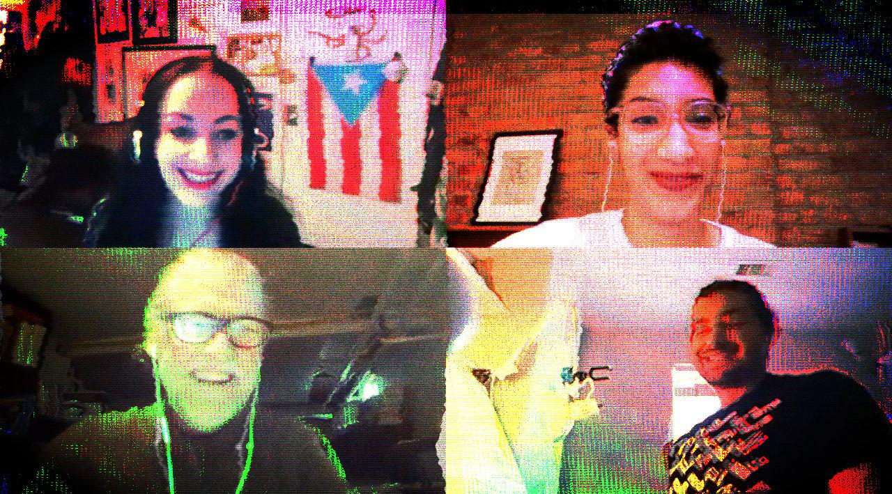
Molly Crabapple moderated a virtual book talk with Elliot Colla and myself for our peculiar little chapbook WE ARE ALL THINGS. It is now streamable at PrintedMatter.org.
Spring is in full bloom here in Houston. The scent of jasmin brushing against you wherever you walk.
I don't know about you but I for one cannot stand to work in a cluttered space. Off to tidy around the house and dive into a deep clean. Tomorrow, I begin work on the very last scene in THE SOLAR GRID #5. Exciting! 🔥
#Journal #Work #Commission

And inks are done (4:30PM).
This marks a bit of a milestone, because come Monday? I transition into my Japan scene that I've been contemplating since at least last year. Excited to finally get to it (and see what the results are)!
Still no rest for the wicked though. Gotta draft tomorrow's newsletter still, and do a couple thumbnail sketches for the commissions I'll be doing over the weekend.
Haven't exercised all week, but come tomorrow I'll work it into my daily routine again.
#Journal #Work #TheSolarGrid #Comix

Two pages, fully penciled by 9:00PM. Not bad considering I started a little late today, at noon. Had I started at 9:00 in the morning, wouldda been done by 6:00.
Early start tomorrow. 🤞
I've read a lot of how-to books on comix. Stan Lee and John Buscema's HOW TO DRAW COMICS THE MARVEL WAY my old man got me when I was... maybe 14-15?
Eisner's COMICS AND SEQUENTIAL ART several years later when I was in college, along with McCloud's UNDERSTANDING COMICS, and probably a bunch of reads along the way. All very good books that deal with the craft of making comix, but I've read nothing—absolutely nothing—on what it takes to actually bring a comicbook out into the world.
Enter Dave Sim's CEREBUS GUIDE TO SELF-PUBLISHING which I only scored a handful of days ago. It's full of gems! Take this bit on time management for example:
“There are things on any given page that you know how to do, and there are things you don't know how to do. You have to do the things you know how to do smoothly and efficiently to buy yourself enough time to solve the problem you don't yet know how to solve.”
And then later:
“Once you have done everything on a page that you know how to do, the parts you don't know how to do become a surrounded enemy.”
Genius.
It's an odd psychological trick that really does save you a shit ton of time. Oh the number of pages I'd attempted to solve the difficult parts on first, pages that would take up an entire week to finish. Stupid, stupid.
#Journal #Work #Comix #MakingComix #TheSolarGrid

Y'know how there's a story-writing rule about making sure that by the end of your story, your characters have gone through big dramatic change from where they were at the beginning of the story?
Yeah, I'm kind of applying that rule to every single page of the graphic novel now. Whereas before... I could have an entire page showing a character running. Multiple panels of a character running, and that is it (page 22, I believe?). Mind you, that particular page I'm shaming is a beautiful-looking page, but if I could have a do-over, I'd probably at the very least show the character run from a significant point A to a significant point B. I s'pose that's part of why I ended up with 38+ page chapters!
Chapter 5 will likely be my shortest chapter thus far, no more than 20-22 pages, even though it covers a lot (i.e. Earth, the Moon, and Mars! 🤯).
What a very long, extensive learning experience this has been (But that's good. If there isn't a degree of learning experience in any project I undertake, I'm not so sure it's worth it).
2:15PM, and I've only finished rough pencils on a single page. Late start today. Will move onto the second before tightening up pencils on both. Should be plenty of time.
#Journal #Work #comix #TheSolarGrid

Noticing my style is becoming a lot more fluid and whimsical, a direct function of operating at speed as well as a change of inking tool (Loew-Cornell #2 brush series 795 Round instead of nibs and/or Staedler Liners).
I'm enjoying what I'm seeing. In a couple pages time though, I switch to a combination of both brush and nib (just as the current scene wraps up, and I move onto the next—which takes place in a different time and place and so calls for a switch in style).
All of these style switches will without a doubt come to inform my “usual” style, so I'm happy to work a little whimsy in there.
I'm also very happy to be getting faster.
To quote Dave Sim: “First you get good, then you get fast, then you get good and fast.”
Didn't get around to finishing pencils on that second page yesterday, so moved it over to today in addition to inking both of them.
Tomorrow I start pencils on two new ones, inks on Friday.
Opened commission requests which I'll work on over the weekends. This is something I'd been reluctant to do in the past tbh, worried that someone might want me to draw the fucking Batman, but the requests I've been getting so far have been pretty cool actually. One such request included “your favorite William Gibson protagonist” for example. 😈
(Granted, if someone really wants me to draw the fucking Batman, I'll draw the fucking Batman.)
#Journal #Work #Comix

Finished my 2 pages worth of inking at 11:30AM today!
Waking up at 5:00AM does have its perks. Been working from 6:00AM with only one half hour break for breakfast and coffee-brewing. Just got my shower in, and will whip up a little lunch and read me some comix before getting on with the second half of the work day: art things in the garage studio, packing orders, and a bit of writing.
Also doing a Zoom discussion with Elliot Colla and Molly Crabapple later today. About WE ARE ALL THINGS for Printed Matter's website.
Inbox at 44, which I should also get to, maybe tomorrow.
I could also do with a haircut.

#Journal #Work #comix #TheSolarGrid
Couldn't draw for shit yesterday. Or write for that matter. Mind and body paying the price for recent insomnia. Got a good night's sleep in though, and today and I cranked out two pages. Sneak:

A good friend stopped by and brought us a jasmine tree! 😃
So nice to see a human face (even if 6 feet apart)!
Will take a short comix-reading break now before drafting tomorrow's newsletter, followed by dinner prep and kicking back with a movie, maybe.
Good day.
#Journal #Work

When I started to fall asleep at 9:00PM last night, I thought to myself: okay great, my body's finally going to make up for lost sleep from the nights prior.
Nope, by 12:00AM I was wide awake. It is 2:00PM now and I have yet to crash.
I think my body's just training itself to deal with the first few weeks of impending fatherhood?
On the upside, finished a page and it's only 2 o'clock, so plenty of time to get started on (and finish) the next.
#journal #work #comix #TheSolarGrid

Just about barely finished penciling a page, pretty loosely at that. Was planning on getting two in the can, but several hours were lost to trying to efficiently pay for and print USPS shipping labels directly through the online shop without jumping around between various applications or dealing with excessive amounts of copy-and-paste. It's either a case of no one having yet designed an intuitive enough system or my having reached an age where I may require millennials to explain shit to me.
I prefer not to ink on the same day I pencil. Only because it requires a slightly different setup given the change of tools: ink, brushes, water instead of just pencil and eraser. So I'm trying to work towards a system of 2 pages a day for penciling followed by a day for 2 pages of inking.
Minus weekends, that would give me 20 pages of finished comix a month. Of course in my case I still have to letter them, so add 4 more days on top that.
In the past, it would simply be impossible to plan things this way, because I'd constantly get invited to fly out to give talks or workshops or put on an exhibition, any of which could take up an entire week at any given time. Now that all of that is gone for the foreseeable future, I can (and should!) operate purely on the basis of a steady producing-from-home/online-retail existence. ¯_(ツ)_/¯
#journal #work
“The line between subject and object blurs in Colla and Ganzeer's clever illustrated chapbook, a narrative formed by prose poems.”
What a lovely review for our unusual little chapbook in Publisher's Weekly.

#work #press