G A N Z E E R . T O D A Y

ComixEngine

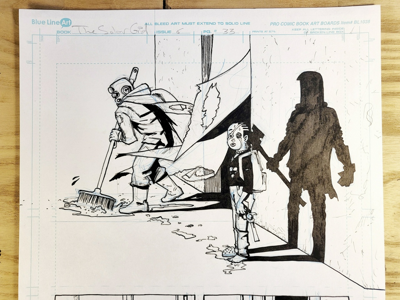
Good gods, I've waited the better part of 7 years to draw this godforsaken panel. Would have loved to get to it while Steve was still among us. Though I'm not too sure how he would've felt about it. But I do hope he's cool with it now, wherever he is.

This, from Joe Biel's MAKE A ZINE, is new to me:

“Simultaneously in New York City, in a parallel world to the Beats, sci-fi fans, and West Coast hippie comix artists, was a teenager named John Holmstrom. Homstrom was a student at the School of Visual Arts who approached the dean and demanded a cartooning program. After his demand was met and world-famous cartoonists Harvey Kurtzman and Will Eisner were hired, Holmstrom dropped out and began working for Kurtzman and Eisner. Next Holmstrom did what any respectable twenty-something would”. He was, for the record, twenty-one. “In 1975 he created a national zine about the infant music movement that he and his friends were involved with.”

That zine was called PUNK, and as such christened the name that would be associated with the genre of music birthed out of that burgeoning scene.

“The inaugural issue featured an impulsive cover feature about The Ramones and a hilarious interview with Lou Reed.”

This connection between Punk and Comix—or Cartooning if you will—is new to me. In fact the connection is double pronged; Not only would the Kurtzman/Eisner-trained Holmstrom define the genre through his zine, but also through his later record-sleeve art for albums by The Ramones.

The connection is even stronger still, given that comicbooks themselves were birthed out of zine culture. After all, prior to the creation of Superman, Joe Schuster and Jerry Siegel produced two zines: TIME TRAVELER and SCIENCE FICTION. Superman himself was conceived as a science fiction strip, but after failing to get any interest from the newspaper syndicates (considered the “proper” gatekeepers of the medium at the time), their only viable option was to put the work out in what was thought to be the “less-sophisticated” comic-book form, published through a company that had only been around for a mere four years* with the bulk of its output penned by the guy who founded it, Major Malcolm Wheeler-Nicholson who also wrote for the pulps (many of which shared their DNA with zine culture, especially compared to the more “professionally”-produced “slicks”).

Fast forward a few decades after Superman's National Periodical Publications becomes the biggest producer and distributor of comic-books across North America, three guys get together (Stan Lee, Jack Kirby, and Steve Ditko) and begin to put out one comic-book anthology after the next (the ideas of which all stem from science fiction) with far more personality and eccentricity than the cookie-cutter corporate stuff produced across the street and in so doing kick off “the Marvel Age of Comics”. What they created may not have been zines per se, but the approach to making the stuff had way more in common with zines than with the decision-by-committee method dominating comicbook corporations today, or heck National/DC at the time. Three dudes making shit up and interacting with their growing readers in the back pages? Sounds like a zine to me, with the single most significant difference being that they had the backing of a single financier who made his coin in the pulps.

A few years later, the underground comix movement would be kickstarted by Robert Crumb's legendary ZAP COMIX, sold on Haight/Ashbury out of a baby stroller. Most definitely a zine.

This inspires a 24-year old “hippie” in Milwaukee to start Kitchen Sink Press and publish other underground cartoonists before reviving Will Eisner's creator-owned THE SPIRIT and reintroducing it and its creator's pioneering genius to a whole new generation. (Eventually, the medium's most coveted award would be named after him.)

Five years later across the Atlantic, a music rag in London called SOUNDS (largely known for covering the rising punk scene) begins running a comicstrip by two art students: Peter Milligan and Brendan McCarthy. One of them would go on to leave his mark on America's two top comicbook corporations and the other would eventually end up co-creating MAD MAX: FURY ROAD. One year after Milligan and McCarthy's stint at SOUNDS, the magazine runs a strip by another young cartoonist by the name of Alan Moore.

One year later back in America, Francoise Mouly and Art Siegelman publish a comix anthology zine using a printing press set up in their residential loft. The hands-on approach to production allows them to experiment with binding, include stickers, and intentionally torn pages. They call it RAW and in its pages Spiegelman runs an odd-looking comix series about the holocaust that involves anthropomorphic animals. It is titled MAUS, and within 12 years becomes the first and only “graphic-novel” to win America's prestigious Pulitzer prize.

A couple years after RAW hits the scene, two Latino punks(!) out of southern California send their self-published zine to a comics journalism magazine (the majority of its content at the time written by the publisher himself) that literally started as an adzine. Hoping to get reviewed, they are instead offered a publishing deal, and LOVE & ROCKETS #1 is published and thus the mighty Fantagraphics is born (also, note the nod to sci-fi in “Love & Rockets”).

Two years later, a couple guys in New Hampshire get together and put out a very amateurish-looking black and white comicbook (practically a zine) filled with unhinged eccentric energy, evident even in the title: TEENAGE MUTANT NINJA TURTLES.

Two years after that a comicshop owner in Oregon starts a black and white comics anthology called DARK HORSE PRESENTS. Many years later, it's where Mike Mignola's HELLBOY and Frank Miller's SIN CITY make their first appearance.

Looking at the comix landscape today, it would seem that comicbooks are for the most part a corporate affair, the drive of which is purely capitalist with little to no substance. Examine history carefully though and it becomes evident that the DIY outsider energy we typically associate with zines and punk, combined with the visionary imagination we ascribe to science fiction, is what creates the special sauce that is the lifeblood of the comix medium.


(*) I lie a little, the history is somewhat more complex than that. Siegel and Shuster did indeed create strips for the Major's publications (Henri Duval, Doctor Occult, and Slam Bradley to name a few) but noticing Wheeler-Nicholson's shoestring operation and inability to make prompt payments, they decided to sit on Superman for a better opportunity, which came in an offer from M.C. Gaines and his plans to produce a weekly comics tabloid thing (so, closer in format to Sunday strips seen in the newspapers, considered the far more legitimate approach to engaging with the medium). Gaines' publication however never materialized, and he was approached by Harry Donenfeld and Jack Liebowitz who had bought Major Malcolm's operation and sought to utilize it with their hold on magazine distribution which they attained through mob and gang connections. They were planning to produce a new regular comic book and asked Gaines if he had any material for it. It was called ACTION COMICS, and the strip Gaines gave them was the first official installment of Superman (I say official because Siegel and Shuster had toyed with proto-Superman ideas well since high school, the first of which might have been the illustrated short story THE REIGN OF THE SUPERMAN published in issue #3 of their SCIENCE FICTION zine, circa January 1933).

#work #comix #TheSolarGrid #ComixEngine

What I mean when I say that THE SOLAR GRID fits nicely on the shelf alongside other books that aren't comicbooks. Fully acknowledging that saddle-stitched pamphlets aren't designed to sit on shelves at all, but that's why they are to be released in a boxed set collecting all 10 issues upon completion, in addition to a hardback compendium also produced in a 6”x9” package (the nature of hardback production though would make it sit at a slightly larger size, probably closeish to the size of that Pauline Kael book).

Over the past 6 some years that I've been working on THE SOLAR GRID, ideas for new stories constantly announce themselves. My response to which is to violently kick them out after making note of their appearance. And literally all the ideas are these tedious longform things and as much as I love working on THE SOLAR GRID, I'd really like to avoid trapping myself in another longform thing and instead land on a format better tailored to my way of being. So I've been looking at shorter things for a while as a way to try and unlock the structure of short episodic storytelling that can simultaneously comprise longish narratives.

Archie Goodwin & Walter Simonson's MANHUNTER is told in 8-page episodes, each largely self-contained. They condense a lot in each page, which is not ideal for the 6”x9” format I prefer, but still there is much to learn from what they are able to accomplish.

STRANGE DAYS by Milligan, McCarthy, and Ewins runs three 8-page episodic features of unhinged absurd imagination, none of which are quite self-contained enough though.

MIRACLEMAN by Alan Moore and Garry Leach also works in 8-page chapters. Not at all self-contained and wordy as fuck, but within this structure they basically create the formula for every single realistic/deconstructive/reinvented superhero comic that has existed since.

(V FOR VENDETTA also works in 8-page chapters if I recall. Which reminds me I ought to re-acquire a copy.)

Adrian Tomine's THE LONELINESS OF THE LONG-DISTANCE CARTOONIST is told in self-contained vignettes of [mostly] 4, 6, and 8 pages. Each can be enjoyed as its own little mini-comic. Bound together in a single volume, it becomes a story of a cartoonist's life from childhood to middle age.

Each volume of Randy DuBurke's HUNTER'S HEART is 94 pages. If it were to be produced annually, that's 7.8 pages a month, let's say 8 pages. Which is 2 pages a week. Very doable.

There's a sweet spot between all the above that I'd love to tap into. A story of unhinged imagination told in self-contained 8-page episodes. Twelve months later, they are bound together in a 96-page book that miraculously tells one longer narrative.

#ComixEngine

Imagine zines —put together crude and fast by 19-28 year olds— given the kind of mass market distribution that only a giant like Condé Nast has access to. The more I read “Golden Age” comicbooks or read about them, the more evident it seems that that is exactly what they were, and it is exactly that that made them so successful.

Many “historians” simplify the birth of comicbooks by painting it as a natural evolution from comic-strips, neglecting the fact that the explosion of comicbooks differed from comic-strips not only in their length, or that they were entire publications dedicated to comics, but that they were incredibly crude, vulgar (even if intended for a younger audience), absurdly imaginative, and created for the most part by very young amateurs.

Chester Gould was 31 years old when he invented DICK TRACY for the newspaper strips. Hal Foster 45 when he started PRINCE VALIANT. Winsor McCay 36 when he launched LITTLE NEMO IN SLUMBERLAND. In contrast: When SUPERMAN hit the stands in ACTION COMICS #1? Siegel and Shuster were both 24 (but claimed to have invented Superman 3-6 years earlier). When BATMAN first appeared in DETECTIVE COMICS #27, Bob Kane was also 24, and his uncredited collaborated Bill Finger was 23. And over the course of their careers, both teams employed hordes of young eager teens, who not only executed the comics but drove many of the ideas within as well.

The comicbook gold rush that followed resulted in hundreds of publications produced by young energetic dudes relishing in outrageous ideas; Bill Everette was 22 when he came up with THE SUBMARINER. Don Rico and Jack Cole were 28 and 26 respectively when they invented DAREDEVIL for Silver Streak Comics (not the same as Marvel Comics' later character of the same name).

Unlike the comicstrips in the papers, these publications had little to no editorial oversight, and the artists behind them had little to no experience making the stuff. The publishers didn't even have editors at the time. What they did have was a salesman, accountant, and printer; resources they utilized to publish softcore porn and get it to as many newsstands, candy shops, and cigar stores as humanly possible. To be fair, they also produced fiction in the form of pulp magazines, but these weren't the mission-driven ones of Hugo Gernsack's early AMAZING STORIES. They were sensationalist drivel, their attraction revolving around shock, horror, and sexual suggestion. When they finally did decide to take on editors for the comics, the job predominantly entailed hunting down material to include in an ever expanding comics magazine empire. They weren't involved in pairing talent as is the case today, nor were they involved in the stories (for a time anyway). It was left up to the cartoonists to put together their own production teams, known at the time as packaging studios (a fancy term for a bunch of friends huddled in a room making fast comix). In short, hardly anyone involved knew anything about comix, most especially the publishers. What they did have was printing knowhow and a vast distribution network which they employed in the service of this new weird comicbook thing.

My point though is that there is powerful value in the uninhibited crude untrained imaginative output of the young. It may not contain anything near the level of craft of the established 30 or 40-something professionals, but it comes with a degree of unbound inventiveness that makes it incredibly awesome. Another thing Golden Age comicbook makers all had in common; the vast majority of them were the sons of Jewish immigrants.

Give a bunch of young immigrants (or the children of immigrants) a platform with mass reach, and watch the culture take huge unprecedented leaps.

Had I half a billion bucks in the bank, that's exactly what I'd do; publish zines by immigrants and their offspring with absolutely no editorial oversight and flood the market with those bad boys and watch society transform.

#ComixEngine

It was a little over a year ago when I reached out to a few indy comix makers to form a collective, whereby we would release 8 monthly titles in PDF format via one dedicated platform, effectively resulting in 2 comix releases per week.

The idea seemed to have been met with great interest, initially, but then it—for whatever reason—just fizzled out.

Given that we practically haven't seen any new comix releases since the outbreak of COVID-19, seems to me like a collective of this sort would've been a really great thing to have around right about now.

Of course, I understand that digital-only releases will never suffice. Quality Collected editions would've been printed, and made predominantly available as direct-order specialty items via our platform. I understand the risk in attempting to bypass the traditional distribution structure, but from the looks of it... that structure has already more or less collapsed now anyway. And y'know, even if not, I'm not so sure it's a bad idea to be a producer of niche specialty things that can't easily be found in all the shops (a'la The Folio Society for books, or heck Allbirds for shoes).

I wouldn't attempt anything like that again though. Managing other people can be... uh, difficult. I'd rather build something that hinges entirely on my own singular output as outlined in Comix Engine 10. That way, if it fails or derails in any way, well then at least it's my fuck up alone (Will maybe start work on it in tandem with THE SOLAR GRID given that I now have the time and have managed to up my production speed).

Still, I think the other idea is a good one for whoever has the managerial bandwidth to pull it off.

9:10AM now. Woke up at 6:00AM after [finally] getting a good 9 hours of sleep! Will package and ship a few orders in the next hour, before getting back to the drawing table. And also have an op-ed to chip away at later in the day. Let's go.

#Journal #ComixEngine

I think I have it.

The publishing model will deliver 3 product types: a monthly PDF, a quarterly print publication, and finally an annual hardback graphic novel.

Here's the breakdown:

1) Monthly PDF

20 pages in total

  • 8 pages: comix
  • 4 pages: prose story
  • 4 pages: essay
  • 2 pages: art/design
  • 2 pages: cover and back cover

    Price: $1

2) Quarterly Print Publication

52 pages in total

  • 24 pages: comix
  • 12 pages: three prose stories
  • 12 pages: three essays
  • 2 pages: inside cover art/design
  • 2 pages: cover and back cover

    Price: $10

3) Hardback Graphic Novel

108 pages in total (including cover)

  • 96 pages: comix
  • 10 pages: chapter breaks & other design inserts
  • 2 pages: cover and back cover

    Price: $30

The idea is to have a single vehicle that would act as the incubator for a regular output of graphic novels. The annual publication being a prestige hardback collecting all the comix put out throughout the year in one single volume. The story would have to be written with 8-page episodic serialization in mind, but with the intent of it adding up to one complete story by the end of the year.

Following year, a completely new story is begun.

All the other stuff going into the monthly/quarterly releases (the prose and whatnot) would remain exclusive to those releases, never seeing print in the annual (because they'd be completely separate from the graphic novel anyway). In terms of production quality, the quarterly would be on the opposite spectrum of the hardback; floppy newsprint.

May have to rely on Kickstarter to fund the annual hardback, but all the work for it would be finished anyway, so it would be super low risk for anyone pledging.

All the output would predominantly be made available through a webshop, delivered directly to readers' doorsteps (or hard-drives in the case of the PDFs), which would at best relegate them to lowkey cultish objects (but the systems surrounding retail distribution have been pretty broken for some time anyway, right?). Media-mail within the US would cost less than 2 bucks per delivery. It gets pricey with international orders which could cost up to $25 a pop.

Can probably cut stockists a 20% off deal when ordering 20+ copies, but I'm not entirely sure how lucrative an arrangement that would be for them.

Listen, I've been haunted by visions of my own little publishing outfit for years and if I don't take a shot at it sooner or later I'm going to die miserable and depressed. First gray hair spotted on my chest last week. One week after having turned 38. Better get this thing going before I hit 40.

I like the idea of getting lowkey cultish print things in the mail. I mean, if Bryan O'Malley or Alison Sampson or Jeff Lemire were making weird photocopy (or riso!) comix that you could only get directly from them? Shit, I'd pay good money for that!

#ComixEngine

I've never cared much for the Fantastic Four. But you have to understand; my formative comix-reading years were the 90's. I started off by reading my older brother's comix, which was mostly stuff from 80's, and before I could totally comprehend much of the dialogue, it was mostly the pictures I was reading. And y'know, compared to 80's X-Men or Ghost Rider or Firestorm... the Fantastic Four just looked a little... meek.

I'm a big believer in seeking out the influences of your influencers though, and both Alan Moore and Warren Ellis have—on more than one occasion—raved about the effect early Fantastic Four had on them (and on the medium as a whole really). So, upon coming across a discounted copy of ESSENTIAL FANTASTIC FOUR, VOL. 1, I snatched it up and read the entire thing during my recent time off in Mexico. And friends, let me tell you... them eccentric Englishmen did not lie.

I could not for the life of me put the book down, and just devoured one adventure after the other. It's obviously goofy as hell, but also... wild? I mean, some of the ideas in there are still just crazy imaginative even by today's standards. The complete lack of inhibition is awfully infectious! There's a scene where Doctor Doom pulls the Four's tower out into space using a magnetic apparatus! And later you have the Submariner hopping between speeding asteroids to make it to Doom's spaceshuttle! Let me say that again: The Submariner (deep sea prince) hopping on asteroids in space!

But the purpose of this post isn't to sing the praises of Stan Lee and Jack Kirby's Fantastic Four. Too many people have done that already, I'm just [super] late to the party.

One of the things I'm concerned with is devising methods to make comix at great speed. And Jack Kirby isn't only the king of comix, but you can also count him as king of the 1000mph club (before there was ever a 1000mph club). It is said that he did about 5-6 pages a day in the 60's. He slowed down a little in the 1970's during his stint at DC, churning out something like 15-20 pages a week (which is still a whole a lot!). If I could sustain an output of half that number per week, I would be so very, very proud of myself. And so it only made sense to carefully study the king's panels and see if there was a code to be cracked. One thing I noticed is that the Kirby reused a lot of the same (or close to the same) panel compositions and figure poses, often within the same issue, multiple times! Here's a rundown of some of the ones I picked up on.

Jack Kirby's Go-To Panel Compositions:

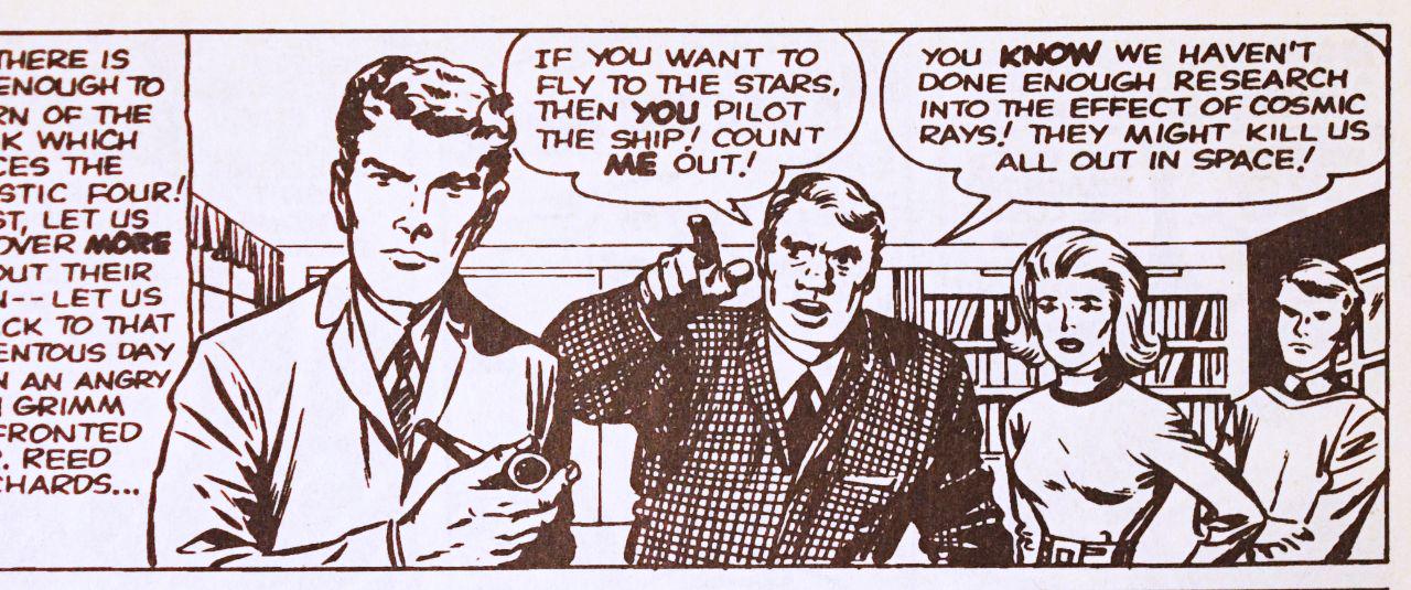
1) Crowd (foreground) pointing at something/someone in background.

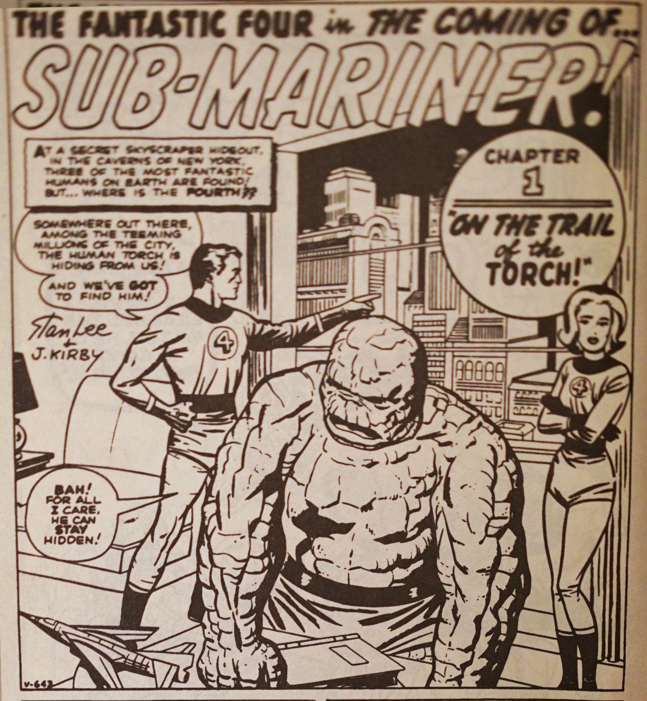
2) Figure (background) pointing at something/someone in foreground (or off panel).

3) Close on hand (foreground) pointing at something/someone in background.

(The last one isn't pointing, and it's from late stage Kirby's SPIRIT WORLD, but it operates on the same basis.)

4) Close on reacting faces (and fit a hand in there).

(Last example from late stage Kirby's SPIRIT WORLD.)
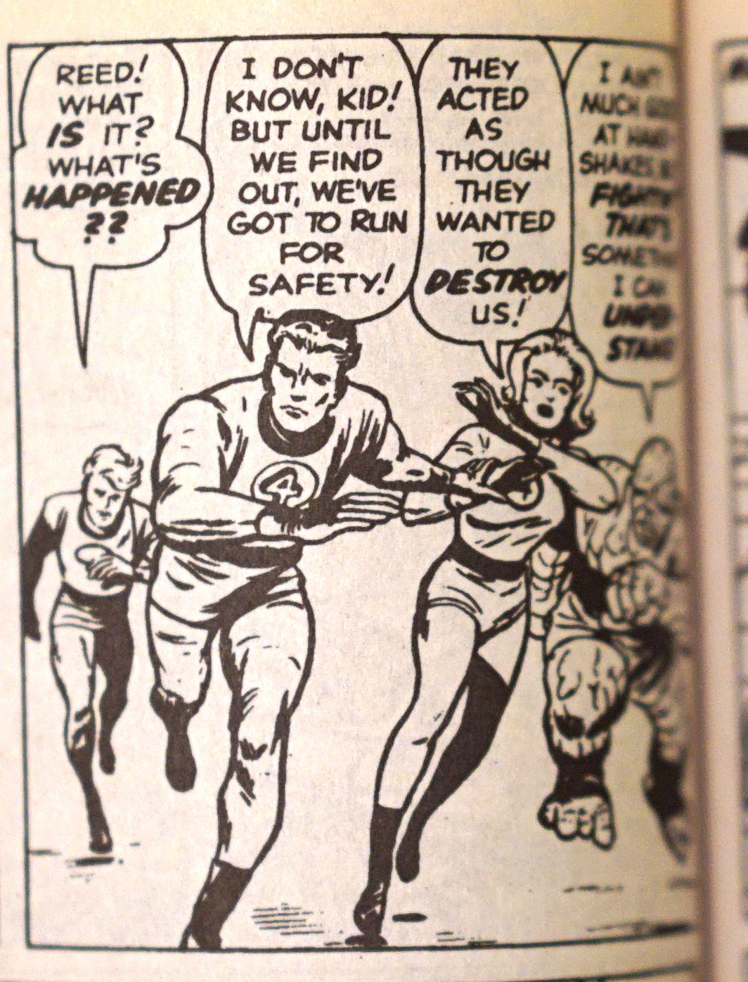
5) Figure running towards reader.

(Last example from late stage Kirby's SPIRIT WORLD.)

6) Full figure running in profile.

7) Medium on character in foreground, with full figure(s) in background.

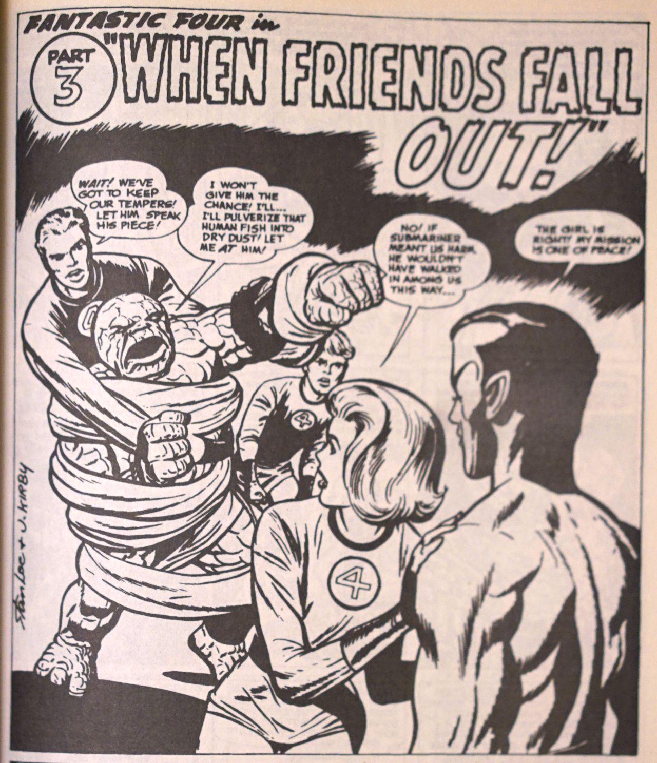
8) Back head in foreground, medium(ish) character(s) in background.

(Last example from late stage Kirby's SPIRIT WORLD.)

9) Close on hand holding something.

(Last two examples from late stage Kirby's SPIRIT WORLD.)

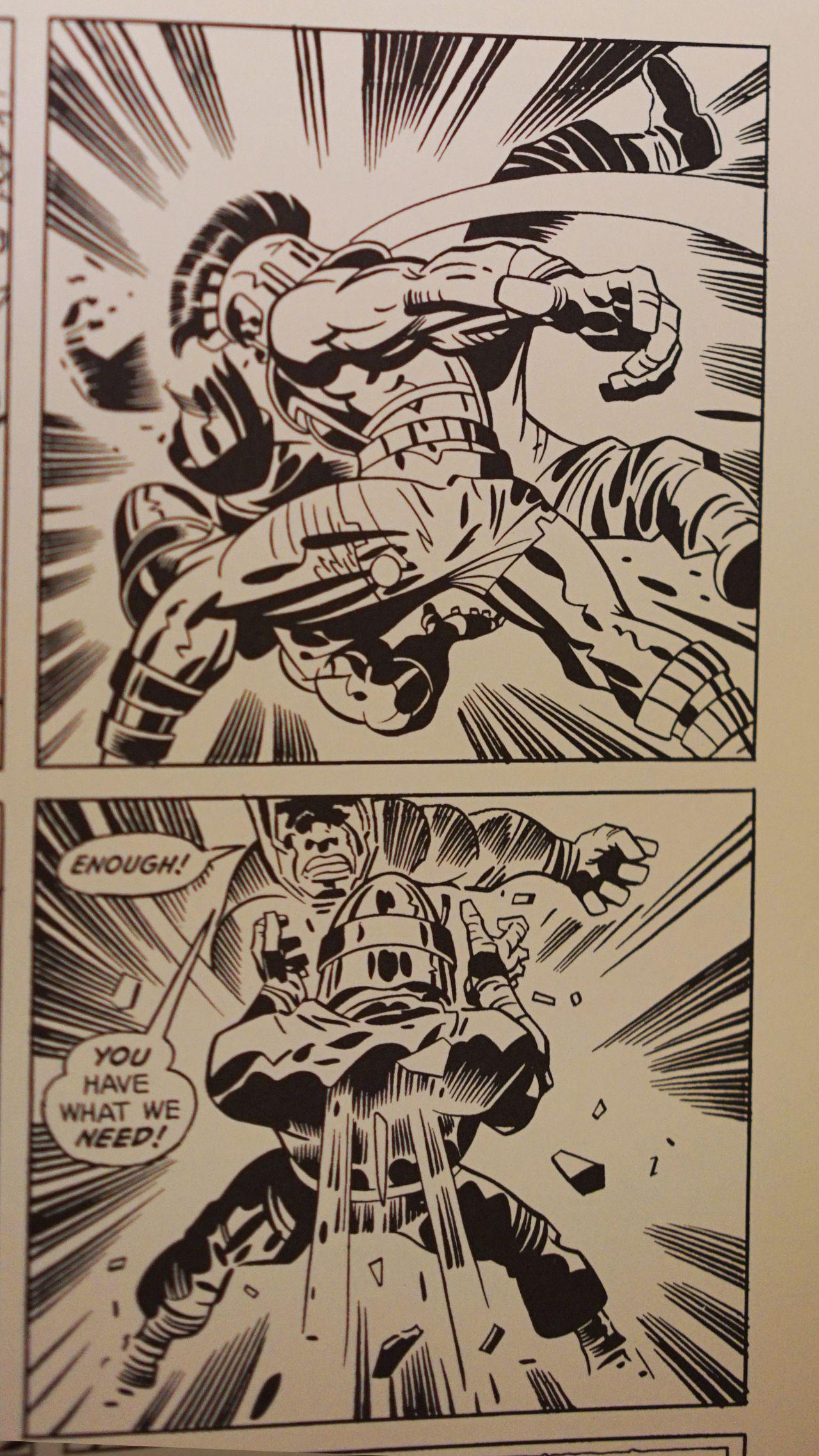
10) Full figure's rearside in foreground, striking or being struck by something/someone in background.

(Last image from from late stage Kirby's SPIRIT WORLD.)

It's likely that every speedster has their key go-to panels that help them burn through pages without having to spend too much time overthinking things. Wally Wood had his notorious 22 Panels That Always Work, for example.

I'm lead to believe that most comix artists today don't necessarily employ such techniques, but most comix artists today lead a miserable existence and/or collapse on a regular basis.

Wouldn't be a bad idea to go back to basics and pick up a thing or two from the oldschool masters who built the foundations of the entire medium to begin with.

Important to note, of course, is that Kirby neither inked nor lettered his own work. Still, that doesn't take away from the achievement of 15+ pages of strictly pencils on a weekly basis.

If one inks and letters their own work, but wants a little exercise in Kirbyism, perhaps go a few weeks doing only pencils with the goal of trying to achieve that same benchmark in a comfortable enough fashion. Once achieved, then you can get to inking and lettering, see how long those tasks take, and then include that in your calculations of how long a page takes. If one can make it anywhere close to 6 pages a week, fully inked and lettered? Well damn, that would be one hell of an achievement, wouldn't it?

And hey, no harm in eventually outsourcing those tasks to collaborators you can trust and rely on.

(This, by the way, is all addressed to myself more than anyone.)

#ComixEngine

In my youth, I used to frequent Cairo's annual book fair, part of which included an exhaustively large open air used-book market called Azbakeya (named after the original location where many of these vendors sell year round).

(Photo via Almasry Alyoum)

The fair gets around 2 million visitors, and one of the biggest attractors is Azbakeya because it's where you can get a lot of books (and magazines and other printed ephemera) for very little money, be it local printed matter or international. It's where I scored many an English-language paperback, vintage Egyptian film posters, obscure publications dating back to the 1920s, slick European design magazines, and also... comix.

But because it's a labyrinth of hundreds of booksellers with hundreds of thousands of people going through their largely unorganized wares at any given minute, you can imagine that going through the stuff to find what you want is, uh, challenging. Knowing that results in a lot of the sellers resorting to shouting, announcing what it is they're selling to the swarms of eager bibliophiles who can hardly see anything because of all the crowding. And this goes on nonstop throughout the day without pause or rest. Of course, with hundreds of sellers shouting over one another, its still hard to hear anything, but somewhere in the frenzied noise of book types and special deals I would be able to make out the singular howl of someone shouting “comix begneih, comix begneih!” (comix for a pound), my annual beacon of joy.

I loved that he used the term “comix” and not the proper Arabic terminology “kesas mosawara” (pictured stories). And in conversing with him, he would say “comix” whether its in reference to multiple comicbooks or a single one (“This comix is brand new.”). In his usage, comix isn't a plural of another word (comic), its entirely its own word that specifically applies to this medium of pictured stories. It's almost as if comix were a material, like wood or metal. It doesn't matter if it's a lot of metal or a little bit of metal, it's all still metal.

That's what “comix” signifies to me. It's the medium. It doesn't matter if it's a single page, a 22 page floppy, or 400 page hardback. It doesn't matter whether it's independent or corporately produced, whether it's superheroes, romance, or memoir, whether its digital or printed. It's all, in essence, the same “material”; it's all: comix.

#ComixEngine

A 90-page publication, 3 times a year is still a little too ambitious, I think. Unless the rate of release is significantly slower than the rate of production, one is prone to screwing themself over.

Paradoxically, the rate of release can't be too slow for a reader's ability to maintain interest (a trap I fell into with THE SOLAR GRID, which very quickly went from bi-monthly to embarrassingly irregular).

I'm also interested in a publication that can include many or most of my other interests and not just comix.

I think one page of comix a week is a reasonable release rate. I mean, there're a couple instances when I've done 8 pages in a single day, but if you count on that as a regular rate of production, you risk terrible burnout.

I think one of the mistakes I made going into THE SOLAR GRID was not having a fixed page-limit per chapter while assuming I could maintain a fixed release schedule. That just doesn't make the slightest bit of sense. Add to that that financially speaking it was hardly bringing in basic rent expenses. Which meant there was no way I couldn't take on additional work to survive. An obvious recipe for disaster.

Back to sustainable formats though:

So, one page a week is a totally reasonable goal I think. Especially if you're writing, drawing, inking, lettering and doing all the things. If there is the occasional week where you crank out more pages? Well great, you're ahead of schedule.

Which means a monthly release of 4 lousy pages. Not a lot.

Obviously not worth printing, so we're talking digital releases here. A reasonable price point in my mind you can charge anyone for a PDF is $1, because it has to be competitive with what you can get in print. Of course new print comicbooks can get pricey, up to $4, but there's always the $1 bin full of old, unorganized comicbooks. Perhaps not fair to put those in the same category as new comix, but y'know what? It's still a print publication containing 20ish pages of comix. If as a digital publication (containing a much lower page count no less) you can't compete with that... then it doesn't seem like a very lucrative product to me.

Now, a 4-page PDF for $1 still comes off as overpriced to me. And therein comes the other things I can produce that aren't comix. A short 1000-wordish prose story per month is very doable. Laying that out in a PDF, along with an illustration, will probably take up around 4ish pages. Probably enough time in the month to fit in a short essay, say 2 pages worth. Add cover art and whatnot and that's pretty much all that ought to be [reasonably] done within a single month.

10 pages + Cover art, comprised of: – 4 pages of comix – 4 pages of prose fiction – 2 pages of essay

For $1.

Now, unless you have a sustained readership of at least three to four thousand, you're screwed because chances are you won't have a whole lot of time in the month for side gigs.

On the upside though, it would result in a sustained output of a 120-page annual publication—which isn't too too bad, is it?

#ComixEngine

There is a panel—a single panel—in THE SOLAR GRID that has been the source of great agony for me. Since starting the book to this very day, I've only ever had to redraw a panel a handful of times. I'm usually good from the first go, but this panel here... it's been killing me. And if I show it to you now, there's no way you would possibly think a panel this simple could have possibly been reached by a jagged road of pain and suffering.

TSG, Ch5, P3

You see what I mean?

I shit you not, that panel there I'd left blank for the longest time, and would go off and do other pages and scenes, then come back to it, try my hand at it, kind of hate it, go off and do other pages and scenes and things, come back to it, try my hand at it again, fail again, repeat.

The reason being: well I hadn't adequately thought about which bits I really needed to focus on. I knew that I needed to depict the exchange of bags. That was the primary “action” taking place in the panel, but I also wanted to depict some more information. Chiefly, the logos on the back of those trench-coats, and also... the trench-coats themselves. The outfits worn by those two figures needed to be seen in clear juxtaposition to the less stylish, more downtrodden attire worn by the figure on the left (Falak). For the longest time, I was convinced we needed to see Falak from the rear just like the two other guys, to emphasize that—unlike them—his outfit featured no logo, and instead just the word “Earth” haphazardly scrawled on the back of his suit. However, any attempt at depicting him from behind made the the transaction of bags seem less obvious. Which was our primary reason for having this panel at all, remember?

Can't let the secondary purpose get in the way of the primary purpose. Especially given that we already see Falak's backside a couple chapters prior.

TSG, Ch3, P7

Those who will notice will. Those who won't will not, and that's okay; it won't disrupt the narrative. It's just a little detail that makes it better, but what will certainly disrupt the narrative is if they can't tell that there's an exchange of bags taking place.

At the end of the day, each line we put onto the page is an additional piece of information that is relayed to the reader, and it's important to be conscientious about what information we are putting out, especially with such a very finite amount of space to depict information to begin with.

I also wanted to depict that this transaction was taking place in a bar. Now, when you look at the resulting panel, you get that they're in a bar. But, it doesn't really capture the “baryness” of a bar, does it? There's no hustle and bustle, there's no backdrop with a bajillion types of liquour, no bartenders working their magic even, and for the longest time I was greedy about wanting to fit aaaaaalll that in. And in my attempts to do just that, I just failed really miserably.

Here's one very bad example:

This one is such a mess because the hierarchy of relevant information is so jacked up, that neither the primary, secondary, or tertiary purposes at all make it through. We can hardly tell that there's a transaction of bags, we can't really get a good look at the outfits or logos, and yes, we can see they're sat at a bar (that's probably the one thing we really get out of the panel in this case), but it's so zoomed out that its hard to tell what the point of focus ought to be. Is it the teardrop-shaped chandelier things? The hardly eligible signage? The pull-down liquor bottles?

The panel I ended up with does the job of communicating that we're at a bar adequately enough, especially when you take into consideration the context within which the panel exists:

TSG, Ch 5, P2-3

It's sometimes easy to forget that a comix panel doesn't exist in a vacuum. It exists in the context of not just the single page, but actually within the context of the double-page spread. And in this particular case, we can clearly get a sense of the bar and it's rowdy atmosphere without needing to jam it all in that one particular panel.

The page is the unit, not the panel.

Sometimes I just need to remind myself.

Another thing the struggle around this panel brought to the forefront for me was the importance of visual “cyphers”. I'll get to that in a future #ComixEngine.

#TheSolarGrid #ComixEngine #MakingComix #Work

All the Manga

There's this Japan segment in Chapter 5 of THE SOLAR GRID that I've been studying a bunch of Manga for. I'm not looking to emulate Manga superficially, not interested in the cliches of what manga style is thought to be (i.e. big eyes and speed-lines), but rather I'm looking to get into its essence. At the end of the day, it's still gonna be very much a Ganzeer comic, but Ganzeer after having soaked up some good Japanese sequential storytelling.

(Regarding that particular edition of Paul Pope's THE ONE TRICK RIP OFF pictured above; it includes a few shorts he did when he worked for Kodansha in Japan, hence it's inclusion in my manga study.)

Some of the rules I've extracted that I'm looking to apply: 1. Ample blank space on page edges, except for the occasional panel or two that extend into the bleeds. 2. Tighter vertical gutters. 3. 3-7 panels per page max. 4. Simple lines, minimal shadows. 5. Various zipatone, patterns, and textures. 6. Very detailed backgrounds and inanimate objects. 7. Simple, animated faces. 8. Big hand-lettered sound effects, even for subtle sounds. 9. Key dramatic moments: realistic rendering. 10. Action: Tilt gutters, show speed in lineart.

#ComixEngine #TheSolarGrid #Work